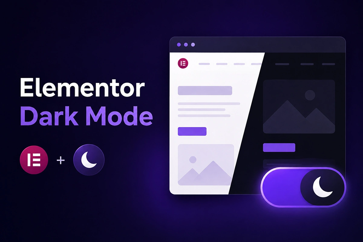
You finally get your Elementor site looking right — the gradient hero, the icon boxes, the logo that reads clean against a white header. Then you flip on dark mode and the gradient turns muddy, the logo vanishes, and a button that looked great an hour ago is unreadable on hover. That’s the real problem behind Elementor dark mode: not whether to add it, but how to add it without wrecking work already done.
One distinction first: this guide covers visitor-facing frontend dark mode, the toggle your site’s visitors see. It isn’t about switching the Elementor editor’s own interface while you build — that’s a separate, editor-only preference for the builder, not the visitor, and the fix for one has almost nothing to do with the other.
Key Takeaways
- Elementor has no native frontend dark mode — its Dark Mode setting only changes the editor interface, not what visitors see.
- Designs break mainly from hardcoded hex colors, background images, gradients, and image-based logos that ignore a color-scheme switch.
- Elementor Global Colors reduce scattered hardcoded values but aren’t a substitute for a visitor-controlled dark toggle.
- Darkify’s free version includes a frontend toggle and OS-aware detection based on prefers-color-scheme.
- Protecting logos, backgrounds, and specific widgets requires Darkify’s Pro-tier element, media, and CSS controls.
- WCAG Level AA contrast requires 4.5:1 for normal text and 3:1 for large text in both modes.
Why Elementor Designs Break in Dark Mode
Elementor writes a lot of styling as specific, per-widget CSS — often with enough specificity that a generic dark-mode stylesheet can’t override it. A hardcoded hex background keeps its exact color regardless of mode, because nothing told it to change.
Hero sections are the clearest example: a background photograph with a dark overlay and white text was tuned for one contrast level, and an image isn’t a color value dark mode can rewrite. Logos are different — a transparent PNG or SVG with dark strokes can disappear against a dark background, and an image-based logo can’t be recolored like text.
Icon boxes and cards often carry their own hardcoded background, separate from your Global Colors, which centralize the palette choices you make deliberately — but a widget-level override still wins. That’s ordinary CSS specificity, not a bug.
Interactive states compound it: a button can look correct at rest and still fail on hover or focus, since those states carry their own hardcoded values. Third-party addon widgets add another layer, shipping markup a generic dark theme can’t anticipate.
Elementor Global Colors and Manual CSS vs. a Dedicated Dark Mode Plugin
Once you understand why designs break, there are two paths to fixing it: extend what you have with Elementor Global Colors and hand-written CSS, or add a dedicated frontend dark mode plugin such as Darkify.
Global Colors plus manual CSS gives you the most control — reasonable for a small site with a predictable design surface. The tradeoff grows with the site: every new section or addon needs its own dark-mode rule, and on an agency site built by different people, that maintenance adds up. Blanket inversion is rarely the right starting point on a design this deliberate; targeted fixes hold up, global ones don’t.
A dedicated plugin like Darkify moves that maintenance into a settings panel instead. The frontend toggle, OS-aware detection, and switch styling are ready in the free version; Pro-tier controls handle page- and element-specific exceptions without hand-written selectors. What you give up is some granular control, in exchange for a panel that’s easier to maintain. Neither approach is universally correct — it depends on how much dark-mode behavior you want to own directly.
| Comparison | Global Colors + Manual CSS | Darkify |
|---|---|---|
| Visitor-facing toggle | Not included — you build it | Included in the free version |
| OS preference support | Possible with custom CSS you write and maintain | Included (OS Aware Dark Mode) in the free version |
| Per-element control | Full, but manual, one selector at a time | Pro-tier allow/disallow controls by element, page, or post |
| Media and logo handling | Manual — you handle every swap yourself | Pro-tier exclusion, inversion, and replacement controls |
| Developer control | Maximum — every rule is hand-authored | Centralized settings, plus a Pro custom CSS field |
| Initial setup effort | Higher — requires a color and selector audit | Lower — settings panel instead of a stylesheet |
| Ongoing maintenance | Manual rule per new widget or section | Centralized panel simplifies updates |
| Best suited for | Developers wanting full control, small predictable sites | Larger Elementor sites, agencies, non-developer owners |
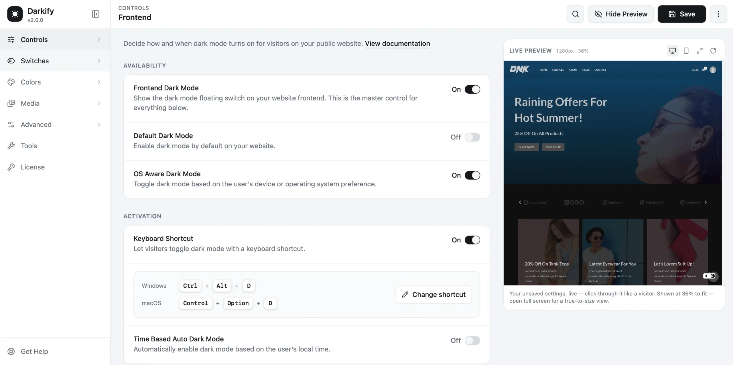
Setting Up Frontend Dark Mode on an Elementor Site With Darkify
Getting a working toggle onto an Elementor site takes minutes; matching it to your design takes longer, and that’s worth budgeting time for. Start with the free version of Darkify on WordPress.org, then find its settings under Darkify’s admin panel menu.
- Install and activate Darkify’s free version from WordPress.org.
- Under Controls, enable Frontend Dark Mode for the visitor toggle; Default Dark Mode sets whether the site loads dark by default.
- Enable OS Aware Dark Mode to follow a visitor’s system preference, via the prefers-color-scheme signal.
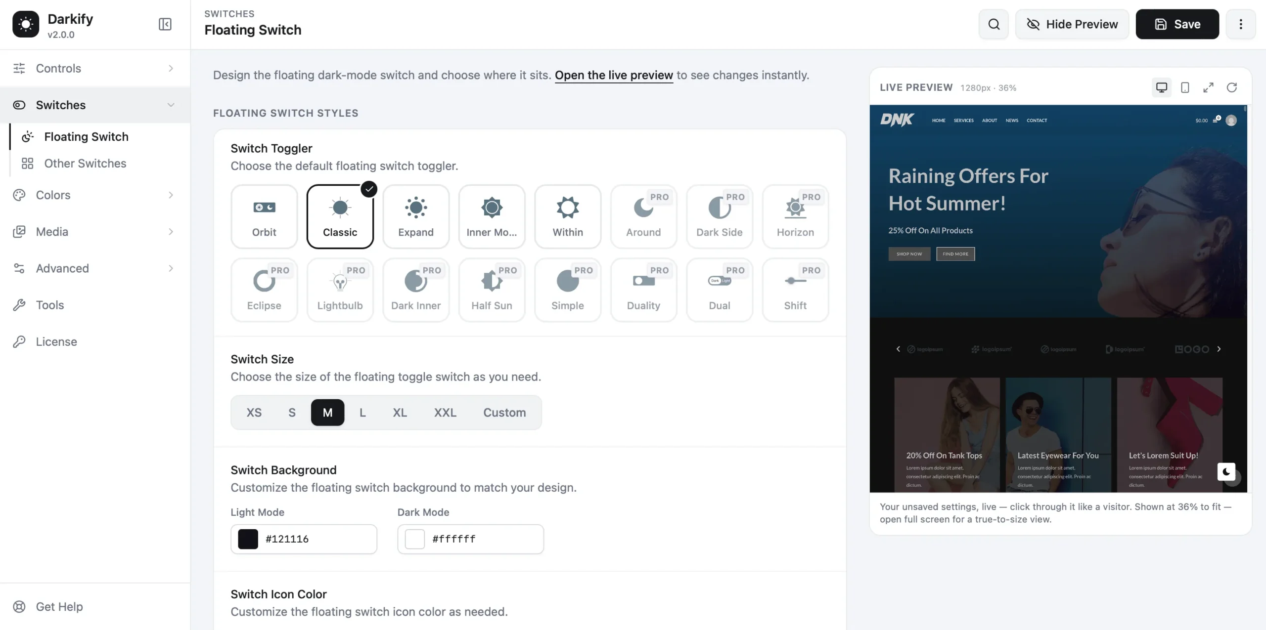
- Under Switcher, pick a style and set its position, size, and colors to fit your header.
- Use Darkify’s live preview on desktop and mobile, then open your existing page in both modes to see what needs attention.
A Workflow for Protecting Your Elementor Design
Treat dark mode as a design review, not a setting you flip once. This sequence gives you a repeatable process for any Elementor page:
- Establish your global dark-mode palette before touching individual widgets.
- Preview the existing Elementor page in dark mode without changing anything yet.
- Identify exceptions — elements that look wrong — instead of editing every widget by default.
- Protect brand assets first: logos, hero images, key graphics.
- Correct sections or widgets with hardcoded colors once exceptions are identified.
- Check hover, focus, and active states, not just resting appearance.
- Test on desktop, tablet, and mobile viewports.
- Regenerate Elementor’s CSS via Tools > General (“Clear Files & Data”) if changes aren’t reflected.
- Clear any caching or CSS/JS optimization layers serving an old stylesheet.
- Test as a logged-out visitor, in a private browser window.
Protecting the Existing Design
Once you know what breaks, the fix usually isn’t “recolor everything” — it’s “protect specific things and leave the rest alone.”
For elements that shouldn’t change at all — a client logo, a deliberately dark hero image, an icon box — Darkify’s Advanced settings let you allow or disallow dark mode on specific pages, posts, or elements by tag, class, or ID. That targeting is Darkify Pro; read Darkify’s documentation on element and page exclusions before excluding things by trial and error.
Media needs its own pass. A white logo on a light header can become invisible on a dark one; a background photo with a light overlay can lose its contrast. Darkify’s Pro media settings can exclude specific images from automatic adjustments, or use a separate image for dark mode entirely — see Darkify’s media-handling documentation for the exact fields.
For anything the settings panel can’t reach, Darkify Pro also includes a Dark Mode CSS field scoped to that mode only, for overriding one stubborn widget without touching your main stylesheet. A logo is one of the last things I’d hand to an automatic color transformation — it deserves a deliberate exception, not a default.
Widget-by-Widget Gotchas in Elementor
Some Elementor components need more thought than others once dark mode is active. Here’s what tends to go wrong, widget by widget.
Hero Sections
A photographic background with white text and an overlay was tuned for one contrast level. Check the overlay opacity, gradient, and text color in dark mode — they were designed together, not independently.
Icon Boxes
Icon boxes often carry a hardcoded background separate from Global Colors, plus an icon or SVG fill that doesn’t follow it automatically.
Buttons
A button can look correct at rest and still fail on hover, focus, or border color — those states carry their own hardcoded values nobody revisits.
Forms
Field backgrounds, placeholder text, labels, and borders need enough contrast against a dark background — validation states deserve the same check.
Tables
Header rows, zebra-striping, and border colors are easy to overlook — low-contrast borders are the most common failure.
Testimonial and Card Widgets
Card backgrounds, drop shadows, quote icons, and text contrast shift together — a shadow tuned for a white card can look muddy or vanish on a dark one.
SVG Icons
SVG fills and strokes are sometimes embedded in the file rather than inherited from CSS, so a color-scheme switch has nothing to hook into unless the SVG allows it.
Videos and Embeds
Embedded players and thumbnails come from a third-party iframe, so their styling is largely outside your — or Darkify’s — control. Plan for that rather than expecting a perfect match.
Sticky Headers
A header that’s transparent at the top and solid on scroll has two states to check — a logo that works on one can fail on the other.
Third-Party Elementor Widgets
Addon widgets often ship their own markup and styling conventions, making them the most common source of unexpected exceptions.
Troubleshooting: Elementor Dark Mode Not Working
If dark mode isn’t showing up correctly — or at all — work through these checks in order rather than guessing:
- Confirm Frontend Dark Mode is enabled under Controls, not just the admin-panel dark mode.
- Confirm the toggle is set to display — check Switcher settings and hide-on-desktop or mobile options.
- Test the page logged out, or in a private browser window; a cached view can hide real behavior.
- Look for hardcoded colors or high-specificity CSS on the section that isn’t changing.
- Regenerate Elementor’s CSS via Tools > General (“Clear Files & Data”) if a change isn’t reflected.
- Clear WordPress, page, and CDN caches that might serve an old stylesheet.
- Temporarily disable CSS/JS optimization to rule out a plugin stripping or reordering styles.
- Check whether the affected widget is a third-party addon with its own markup.
- Review exclusion or custom CSS rules already set — an old exception can conflict with a new one.
- If it persists, consult Darkify’s documentation or support before assuming it’s a bug.
Pre-Publish Testing Checklist
Run through this list on the live page before publishing, not just in the Elementor editor:
- Desktop, tablet, and mobile viewports
- Manual toggle and OS-preference behavior, if enabled
- A full page refresh and navigation to a second page, to confirm the mode persists
- A logged-out visitor session, in a private browser window
- Header and footer, including any sticky-header scroll states
- Hero section backgrounds, overlays, and text contrast
- Forms: field backgrounds, placeholder text, labels, and borders
- Buttons and links in their normal, hover, and focus states
- Logos and SVG icons
- Background images and gradients
- Tables and testimonial or card widgets
- Any third-party Elementor addon widgets on the page
- Caching and CSS/JS optimization, cleared or excluded as needed
Accessibility Notes for Elementor Dark Mode
Dark mode is a design preference, not automatically an accessibility win — contrast still has to hold up in whichever mode a visitor sees.
WCAG’s Level AA contrast guidance requires 4.5:1 for normal text and 3:1 for large-scale text against its background, in dark mode exactly as in light mode. A dark background with slightly-too-dark text fails the same way a light background with slightly-too-light text does.
The prefers-color-scheme media query is the standard mechanism browsers use to expose a visitor’s OS-level theme, and Darkify’s OS Aware Dark Mode setting is built on that signal. Confirm during testing, not assumption, that a manual choice persists across pages and that hover and focus states stay readable in both modes.
Performance Notes
Any plugin adds some overhead, and Darkify is no exception — the real question is whether that overhead is reasonable, not whether it’s zero. Per Darkify’s own listing, it’s built with a performance-first approach: lightweight CSS and JS, compatible with common caching plugins. That doesn’t mean zero measurable impact, and no independent benchmark numbers are available to cite. In practice, the bigger performance risk on an Elementor site is usually caching and optimization layers that need to be told about the new stylesheet — why the troubleshooting steps above check caching first.
Frequently Asked Questions
Making Elementor Dark Mode Work With Your Design, Not Against It
Getting elementor dark mode right isn’t about turning a setting on — it’s about deciding, deliberately, what should change and what shouldn’t. Global Colors and hand-written CSS work if you want full control on a small, predictable design surface. A dedicated plugin gets you there faster if you’d rather manage exceptions through a settings panel.
Either way, start by reviewing your existing Elementor page in dark mode before changing anything. If you want the settings-panel route, Darkify’s free version is available now on WordPress.org, and its documentation covers the exceptions and media controls this guide walks through.