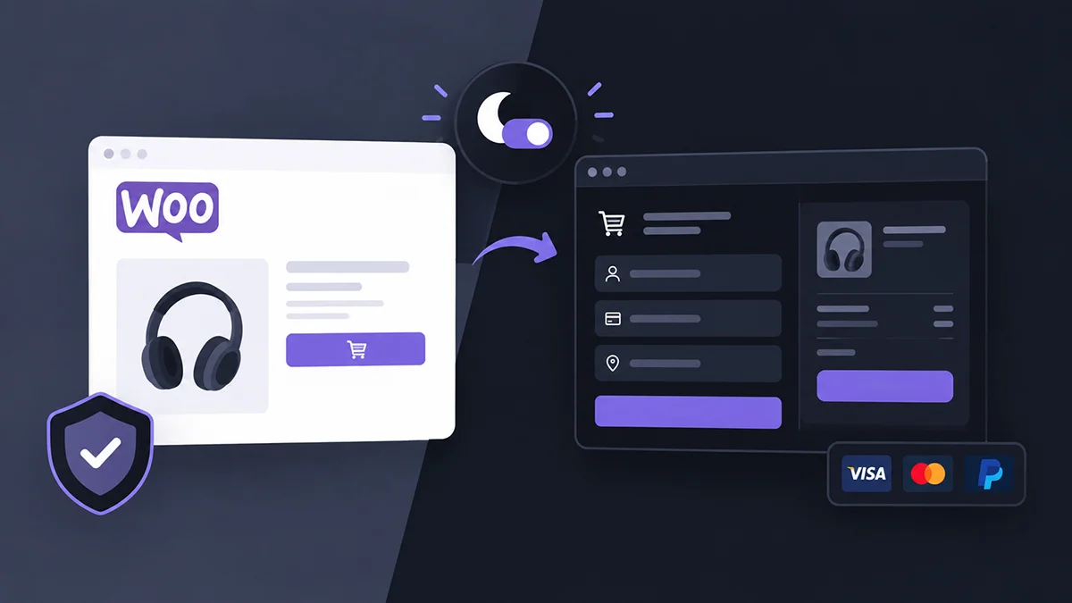
Dark mode on a content site is mostly an appearance preference. Woocommerce dark mode is different, because it touches the controls people use to spend money. A product image can render wrong, a sale price can lose its visual hierarchy, and an Add to Cart button can drop to low contrast — each one a usability and trust risk worth testing like any other checkout UI change, not just a color swap.
Key Takeaways
- WooCommerce’s Checkout Block has a “Dark Mode Inputs” setting, but it only adjusts form-field legibility on a dark background you already have — not a store-wide dark mode system.
- Modern Cart and Checkout Blocks use different markup and update mechanisms than classic checkout, so a fix on one may not transfer to the other.
- Product photography and variation swatches should generally be preserved rather than automatically inverted, since color often carries real product meaning.
- Cross-origin payment iframes can’t be restyled with parent-page CSS — check whether your gateway offers its own appearance controls instead.
- Blanket-inverting an entire checkout is usually the wrong strategy; payment badges, form states, and totals each need deliberate treatment.
- Run an actual test order — product selection through confirmation — before enabling dark mode broadly on a live store.
Why WooCommerce Makes Dark-Mode QA Harder
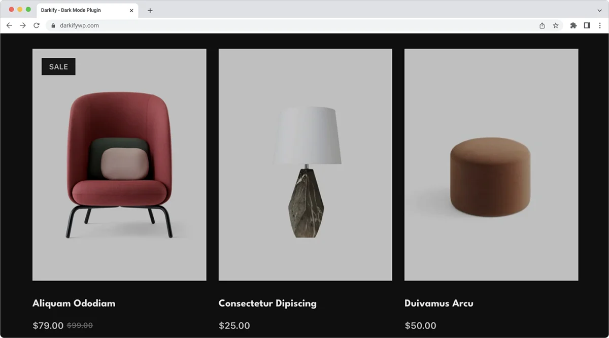
A blog post has mostly static text and images. A WooCommerce store has dynamic product data, variations, stock badges, client-side cart totals, and payment UI sometimes rendered by a third party — each a separate thing that can look wrong in dark mode.
It’s also not one architecture. Modern Cart and Checkout Blocks run in JavaScript on WooCommerce’s Store API, while classic checkout still renders from PHP templates via the [woocommerce_checkout] shortcode — and WooCommerce has no plans to remove classic checkout. Page-builder templates add a third specificity layer on top of either, which is where most audits go wrong.
Auditing the Product Page
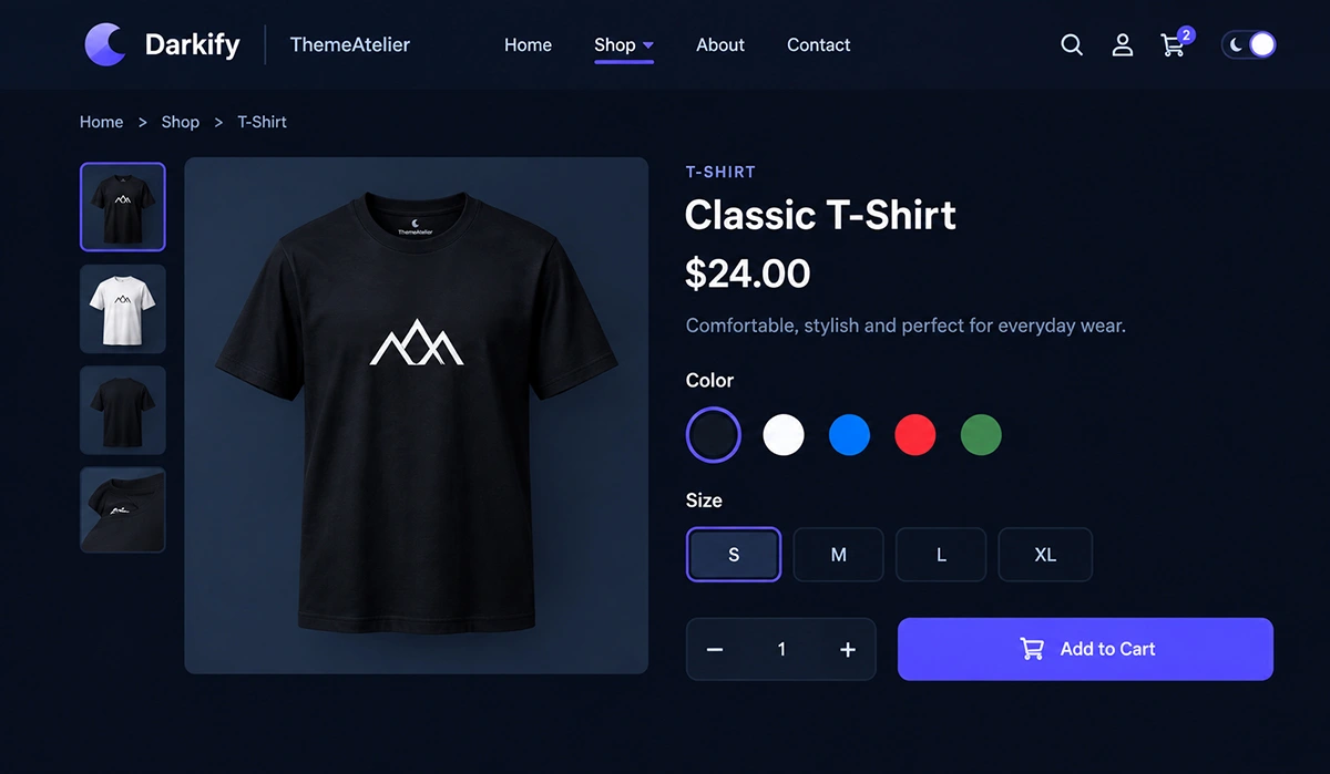
Gallery and Product Images
A transparent PNG or WebP with a baked-in white background looks wrong in dark mode; a genuinely transparent asset holds up better. Check image borders and lightbox backgrounds too — easy to miss since they only appear on interaction.
Image Handling
Product photography should generally be preserved rather than globally inverted — dark mode should adapt the interface around the image before it alters the image. Simple monochrome diagrams or icons tolerate more aggressive treatment than a photograph can.
Price and Stock Status
Check regular, sale, and struck-through prices for the same hierarchy as light mode. Stock, backorder, and low-stock messaging often use fixed theme or extension colors — don’t assume red and green translate correctly.
Variation Swatches and Ratings
Don’t automatically invert color, texture, or material swatches — their actual color may be the product information a shopper is choosing between. Confirm ratings stay visible too, with empty and filled stars distinguishable against the new background.
Add to Cart, Tabs, and Related Products
Test Add to Cart in its default, hover, focus, disabled, and loading states — not just resting appearance. Check tabs for readable active states, and audit related-product cards separately, since they often use a different template than the main layout.
Auditing the Cart
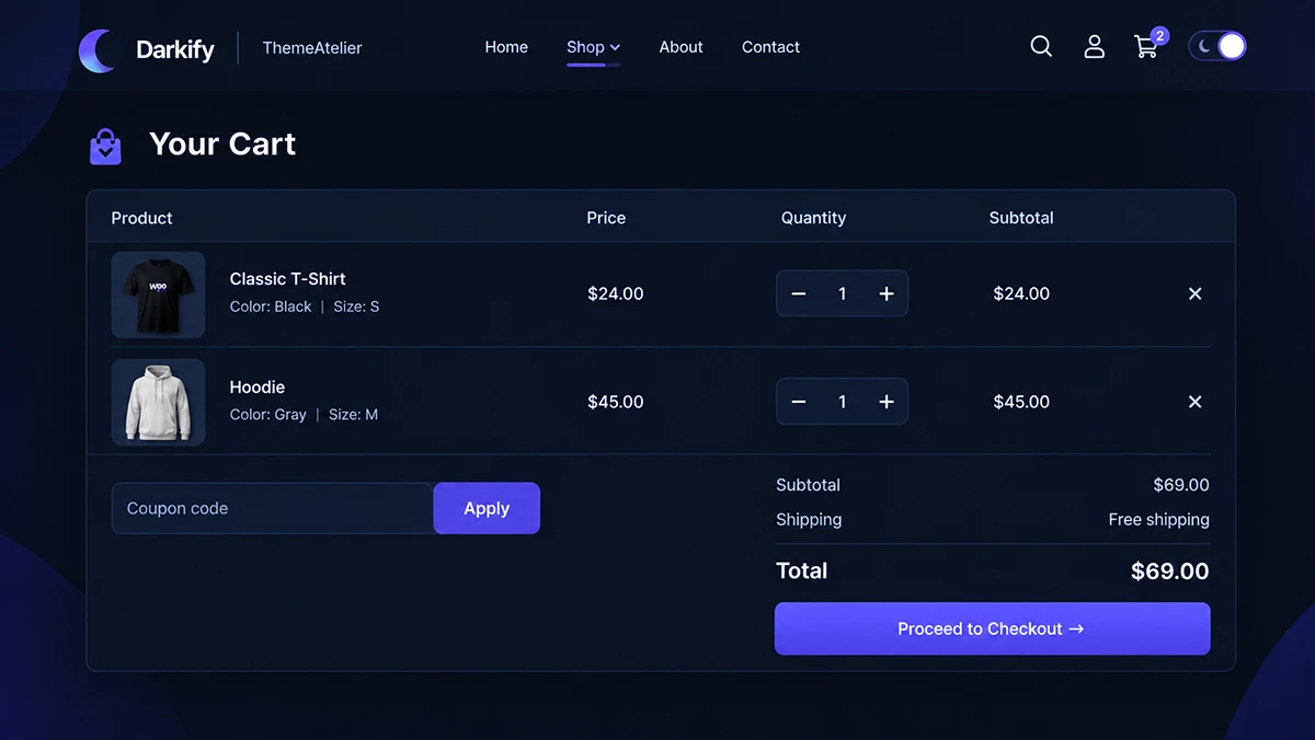
Check item names, thumbnails, prices, quantity and remove-item controls, the coupon field, totals, shipping, cross-sells, and Proceed to Checkout — each can carry its own hardcoded color.
Dynamic cart behavior isn’t uniform. Classic AJAX updates rely on the wc-cart-fragments script, but the Mini-Cart block has its own update mechanism and doesn’t use that API — a fix targeting fragment-based markup may do nothing on a block-based Mini-Cart, and vice versa.
Auditing Checkout, Where Most Problems Hide
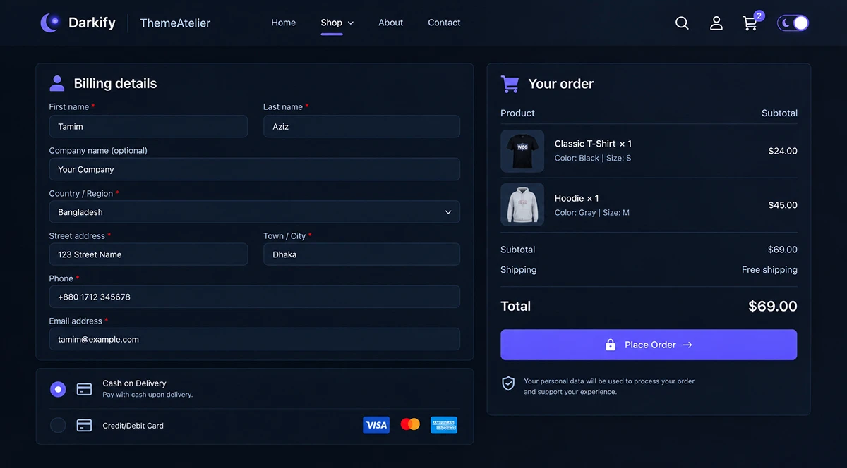
Form Fields and Autofill
Test field backgrounds, input text, labels, placeholder text, borders, focus and disabled states, and required/optional indicators. Keep placeholder text a hint, not a label substitute — it disappears once someone starts typing.
Autofilled fields are their own problem. Browsers style autofilled inputs with !important, so background-color and text color on a focused autofilled field generally can’t be overridden, though you can override them once unfocused, and appearance any time. That’s why an otherwise-fine checkout can still show a jarring light autofill box:
/* Dark-mode-only autofill legibility fix.
   Replace .YOUR-DARK-MODE-CLASS with your site's actual
   dark-mode class or attribute selector. Scope it further
   to your checkout template if you want it limited there. */
.YOUR-DARK-MODE-CLASS input:autofill,
.YOUR-DARK-MODE-CLASS input:-webkit-autofill {
  appearance: none;
  background-color: #1e1e1e;
  color: #f5f5f5;
}
Both selectors appear because :autofill isn’t yet supported everywhere, and :-webkit-autofill is its documented alias for broader compatibility. Expect the override once the field loses focus, not instantly — a browser limitation, not a bug in this snippet.
Validation, Order Review, and Payment Methods
Validation text, warning banners, error borders, and success notices need to stay distinguishable — don’t rely on color alone, and don’t blindly darken every error state without rechecking contrast. Product names, subtotal, shipping, taxes, and the final total should keep the same visual weight they had in light mode.
Payment UI isn’t one thing. Depending on the gateway, it may be merchant-controlled HTML, a WooCommerce Blocks component, or a gateway-hosted field inside a cross-origin iframe — browser security rules mean CSS generally can’t reach inside that iframe’s document. If a gateway offers its own appearance API, use it instead of working around the boundary.
Payment Badges and the Place Order Button
Don’t globally invert Visa, Mastercard, PayPal, or other gateway trust marks — recoloring trademarked assets can conflict with brand guidelines and undermines the recognition they exist for. Treat Place Order as conversion-critical: test normal, hover, focus, disabled, and loading states, and don’t let it blend into the background.
Should Checkout Be Excluded From Dark Mode?
There’s no universally correct answer — pick based on how much testing you’re willing to commit to.
- Full dark checkout — reasonable once every component and gateway has actually been tested, not assumed to work.
- A controlled “safe dark” checkout — a conservative palette with high clarity and fewer visual transformations than the rest of the theme.
- Keep checkout light — reasonable when third-party payment UI can’t be made consistent or tested confidently.
Checkout is the last place I’d accept an untested automatic color transformation. If you can’t verify every gateway you use, option two or three is more defensible than assuming a global dark theme renders correctly everywhere money changes hands.
Block Checkout vs. Classic Checkout (and Page Builders)
Cart and Checkout Blocks became the default for new stores starting with version 8.3, built in JavaScript on the Store API. Classic checkout still renders from PHP templates and remains fully supported — WooCommerce has no plans to remove it. A fix for one doesn’t automatically work on the other.
WooCommerce’s own guidance discourages styling Blocks via internal class names, since that markup is documented as private and subject to change; Global Styles (theme.json) is the recommended approach, with only a handful of component classes documented as stable. A page-builder checkout adds yet another specificity layer — exactly why a fix that works on a stock checkout can fail on a customized one.
Setting Up Darkify for a WooCommerce Store
Start with Darkify‘s free version, available on WordPress.org. Per its plugin listing, it’s WooCommerce ready and applies dark styling to product, cart, and checkout layouts, compatible with popular themes and page builders without modifying theme files.
- Install and activate Darkify, then enable frontend dark mode.
- Decide between manual visitor switching and OS-aware behavior, where supported.
- Choose a toggle placement, then check it on mobile separately from desktop.
- Review the shop/archive page, then a simple product, then a variable product.
- Review the cart, then checkout, then each payment method your store actually offers.
- Add exceptions or custom colors only after you’ve identified actual problems — not preemptively.
WooCommerce headers tend to be dense — cart icon, Mini-Cart, account icon, search, sticky nav, sometimes a chat widget or cookie banner. Test whether a floating toggle collides with any of them on desktop and mobile before settling on a position.
Protecting Product and Payment Assets
Darkify doesn’t ship a WooCommerce-specific settings panel — protecting product photos and payment badges means using its general element, media, and color controls, all part of Darkify Pro. Darkify’s documentation on element targeting covers excluding elements; Darkify’s media-handling documentation covers excluding or replacing images.
For a stubborn checkout widget the settings panel can’t reach, Darkify Pro also includes a dark-mode-scoped custom CSS field. A payment badge isn’t an asset I’d hand to a generic exclusion rule — verify it directly against the checkout it appears on.
Troubleshooting: WooCommerce Dark Mode Not Working
Work through this in order rather than disabling plugins at random:
- Identify exactly where it fails: shop, product, cart, checkout, or only payment fields.
- Determine whether that page uses Blocks, classic shortcode/template, or a page-builder checkout.
- Confirm Darkify’s frontend dark mode is active, then retest logged out.
- Check the active theme or page builder for hardcoded colors on that element.
- Review any Darkify exclusions, restrictions, or custom colors already set.
- Review dynamic states — updated totals, validation, loading, payment-method switching.
- Check caching or optimization settings only if they actually touch that frontend page.
- Check third-party checkout or payment extensions for conflicting styles.
What Breaks and Why
| Area | Common Failure | Likely Cause | Safer Fix |
|---|---|---|---|
| Product gallery | White box around a “transparent” image | Baked-in white background in the source file | Replace with a genuinely transparent asset |
| Variation swatches | Swatch color changed or inverted | Blanket color-inversion rule | Exclude swatches from automatic recoloring |
| Pricing | Sale price loses visual hierarchy | Strike-through or muted-color style not re-checked | Re-verify contrast between regular and sale price |
| Cart totals | Total blends into background | Low-contrast text color inherited from theme | Set an explicit, tested color for totals |
| Checkout fields | Border or placeholder invisible | Border/placeholder color too close to background | Increase border and placeholder contrast |
| Autofill | Bright light box appears on autofill | Browser-locked autofill background on focus | Scoped :autofill/:-webkit-autofill override |
| Payment badges | Card logos recolored or inverted | Global image-inversion setting | Exclude payment badges from image processing |
| Place Order button | Button blends into checkout background | Button color too close to surrounding surface | Re-test button contrast against the dark background |
Dark Palette Starting Points
These are starting-point suggestions, not universal accessibility-safe colors — every pairing was contrast-checked for this specific combination, but compliance depends on the actual pairing, text size, and component context you use.
| UI Role | Starting Color | Pair With | Testing Note |
|---|---|---|---|
| Page background | #121212 | #f5f5f5 text | 17.2:1 — passes normal-text contrast |
| Surface/card | #1e1e1e | #f5f5f5 text | 15.3:1 — passes normal-text contrast |
| Primary text | #f5f5f5 | #121212 background | Same 17.2:1 pairing as above |
| Secondary text | #b0b0b0 | #121212 background | 8.6:1 — passes normal-text contrast |
| Border (functional) | #666666 | #121212 background | 3.3:1 — passes the 3:1 UI-component threshold |
| CTA / button | #2f5fdd | #ffffff text | 5.5:1 — passes normal-text contrast |
| Success | #34d399 | #121212 background | 9.7:1 — passes normal-text contrast |
| Warning | #eab308 | #121212 background | 9.8:1 — passes normal-text contrast |
| Error | #f87171 | #121212 background | 6.8:1 — passes normal-text contrast |
Accessibility and Performance
WCAG’s contrast requirements aren’t one flat number — button text, component boundaries, and focus indicators fall under different criteria, so “every button needs 4.5:1” oversimplifies it. Pure black backgrounds with white text don’t inherently fail accessibility; softer palettes are a comfort preference, not a WCAG requirement. Don’t rely on color alone for errors, and check focus indicators explicitly.
The prefers-color-scheme media query reflects OS or browser preference — it has no visibility into a manually selected in-app toggle, so don’t treat the two as interchangeable. On performance, any plugin adds some overhead; treat vendor performance claims as vendor claims rather than independent benchmarks, and verify page-speed impact on your own store.
Pre-Launch Testing
Before enabling dark mode broadly, place an actual test order using a sandbox or test payment method rather than a live charge. Walk through product selection, a variable product, a quantity change, any coupon, address entry with autofill, shipping, a deliberate validation error, payment selection, Place Order, and confirmation. Subscriptions or bookings need their own separate pass.
- Desktop, tablet, and mobile
- Chrome, Firefox, and Safari where available
- OS light preference, OS dark preference, and manual toggle
- Preference persistence after navigating to another page
- Shop, category/archive, simple product, and variable product
- Cart and Mini-Cart, if present
- Checkout fields, autofill, and validation errors
- Every payment gateway and express-payment button your store actually offers
- Place Order and the order confirmation page
- A logged-out shopper session, with caching enabled
Frequently Asked Questions
Shipping WooCommerce Dark Mode Without Breaking the Cart
Getting WooCommerce dark mode right means treating product pages, cart, and checkout as three separate QA passes, not one setting. Audit what breaks, decide how far dark mode extends into checkout, and run a real test order before rolling it out broadly.
Darkify’s free version is a reasonable start if you’d rather manage exceptions through settings than hand-write every selector, and Darkify’s documentation covers the targeting and media controls this guide references in more depth.