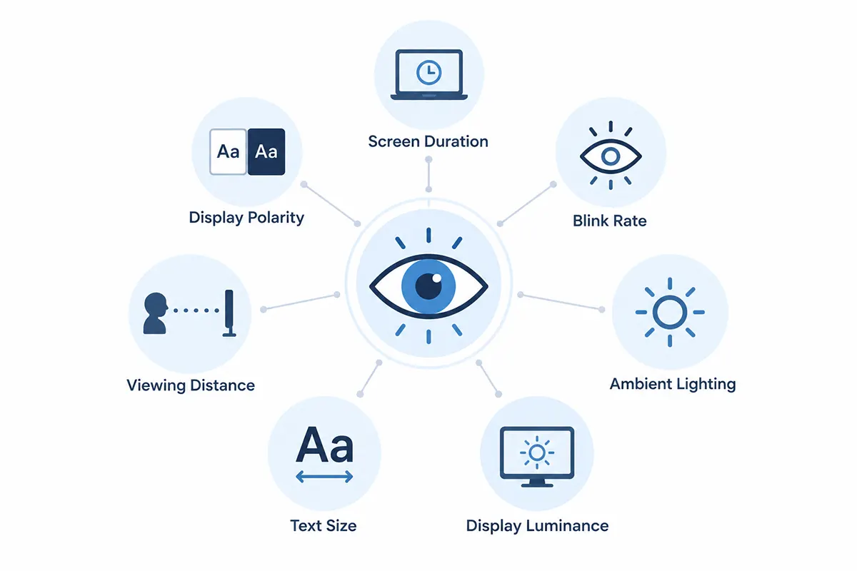
“Dark mode is easier on your eyes” shows up in app descriptions, tech articles, and product marketing so often it reads as settled fact. It isn’t. Does dark mode reduce eye strain? Research doesn’t support treating it as a universal fix. Dark mode can feel more comfortable in some conditions — but display brightness, ambient lighting, screen time, blink behavior, text design, and individual visual needs can matter as much or more than which color scheme you’re using.
Key Takeaways
- Controlled research does not show dark mode universally prevents or eliminates digital eye strain — results are genuinely mixed across studies.
- Dark mode can reduce perceived fatigue specifically in bright ambient lighting, but that advantage disappears or reverses in dim rooms in at least one controlled study.
- Some research finds dark text on a light background produces better reading and proofreading performance than light text on dark, under tested conditions.
- Personal preference and clinically measured eye strain are not the same outcome — people can genuinely prefer dark mode without it improving measured fatigue.
- Digital eye strain has many contributing factors beyond color scheme, including blink rate, screen duration, and uncorrected refractive error.
- The exact “20-20-20” break schedule lacks strong controlled support, though taking regular breaks from near work is still broadly recommended.
What Is Digital Eye Strain?
The American Optometric Association describes digital eye strain, also called Computer Vision Syndrome, as eyestrain, headaches, blurred vision, dry eyes, and neck or shoulder pain associated with prolonged screen use. The American Academy of Ophthalmology is direct about one common fear: looking at screens for long periods does not permanently damage your eyes. Symptoms are typically temporary and tend to ease after stepping away from the screen, though they can persist if an underlying cause — like uncorrected refractive error — goes unaddressed.
Changing theme polarity addresses only one part of that environment. The rest of this article covers what the research actually says about that one part.
What the Research Says About Dark vs. Light Mode
Visual Fatigue
Controlled studies genuinely disagree here. Pathari et al. (2024), testing 18 participants on smartphones, found dark mode produced significantly lower self-reported eye fatigue than light mode — but only in bright ambient lighting (460 lux); in a dim room, the difference disappeared, and most participants actually reported worse fatigue in dark mode. Sengsoon and Intaruk (2025), testing 30 tablet users under moderate ambient light, found no significant difference in visual fatigue between modes at all. Neither result supports a blanket “dark mode reduces fatigue” claim.
Reading and Task Performance
This is where the evidence leans the other way. Piepenbrock, Mayr, and Buchner found that positive-polarity displays — dark text on a light background — produced smaller pupil size and better proofreading performance than negative polarity, in both younger and older adults, an effect a 2025 follow-up study found replicates in newer display contexts. Sethi and Ziat (2023) similarly found negative polarity associated with higher cognitive load in several conditions using eye-tracking measures. Under tested reading and proofreading conditions, negative polarity does not have a consistent performance advantage — if anything, the opposite.
Dry-Eye Symptoms
Screen use itself reduces blink rate and blink completeness — the American Academy of Ophthalmology notes normal blink rate can drop from around 15 per minute to 5–7 during device use — and that’s linked to dry-eye symptoms regardless of color scheme. A comprehensive 2021 dry-eye review found no significant relationship between screen-display factors like glare filters and dry-eye risk, and didn’t identify polarity as a driver. One tablet study did find a smaller dry-eye symptom increase with dark mode than light mode, but both increased with use — treat this as a minor, single-study signal, not an established effect.
Subjective Preference
People can prefer dark mode for reasons that have nothing to do with measured eye strain — aesthetics, habit, or simply liking how it looks. One study found dark mode reduced fatigue by objective measures like blink rate, while light-mode users still reported higher subjective comfort, attributed to habituation to light-background interfaces. Preference and measured physiological outcome pulled in different directions in the same study — a clean illustration of why “I prefer this” and “this reduced my eye strain” are different claims.
Environmental Lighting
This may be the most consistent finding across studies: ambient light changes the picture more than the color scheme does. Pathari et al. found dark mode’s screen brightness stayed much closer to ambient light levels than light mode’s did in a bright room — a smaller luminance gap that may explain the comfort difference better than “dark” itself does. Interestingly, OSHA’s own workstation guidance recommends dark text on a light background specifically to reduce glare in typical office lighting — a reminder that the “right” choice depends on the room, not a universal rule.
When Dark Mode May Feel Better
Dark mode may help when the room is dim and the alternative is a very bright screen fighting against low ambient light — the luminance-gap mechanism above supports this specifically. Some people also simply find darker interfaces more comfortable, and some with light sensitivity report benefiting from lower-luminance displays. None of this requires dark mode to show a measurable clinical benefit to be a legitimate reason to offer it — comfort and preference are real, even without a proven physiological effect behind them.
When Light Mode May Be Easier to Read
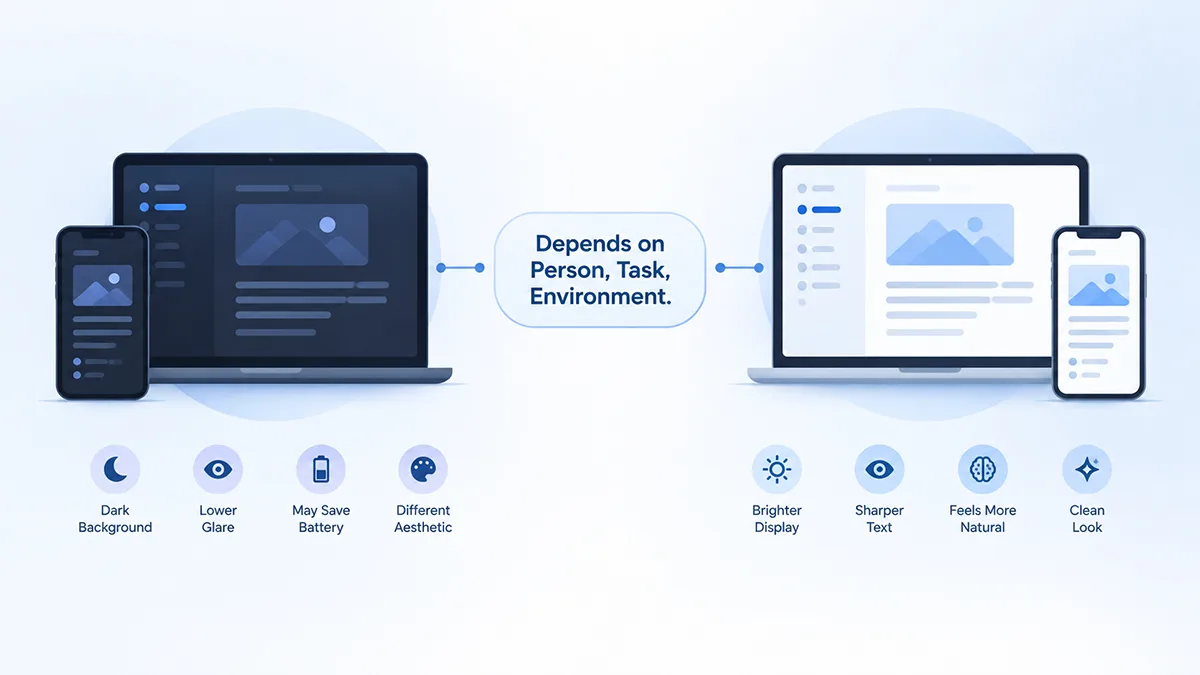
For long-form reading, proofreading, and similar visual-search tasks, positive polarity has shown a performance edge in more than one study, plausibly connected to pupil constriction and sharper retinal focus under higher luminance. Bright office environments are also where OSHA’s glare guidance favors light backgrounds. This doesn’t make dark mode wrong for those settings — it means the reading-performance case for negative polarity is weaker than the marketing suggests, not that everyone should switch back to light mode.
Why Personal Preference Still Matters
A person can legitimately prefer dark mode even though studies don’t prove it universally reduces eye strain. For website design, preference alone can justify offering a theme choice — you don’t need a clinical study to justify giving visitors an option they’ll use. What matters is not confusing “visitors like this” with “this is medically better for them.” That distinction is the natural bridge from personal screen habits to how a WordPress site should actually present the choice.
What Helps With Screen Discomfort, Regardless of Mode
Regular breaks from sustained near work are widely recommended by both the AAO and AOA. The exact “20-20-20” formula — every 20 minutes, look at something 20 feet away for 20 seconds — is popular, but a 2023 randomized study testing break intervals of 5, 10, 20, and 40 minutes found no significant effect of the specific schedule on symptoms, reading speed, or accuracy, even though symptoms increased with time on task across all conditions. The precise numbers aren’t strongly supported; taking breaks at all is.
Beyond breaks: comfortable viewing distance and text size, reduced glare, screen brightness suited to the room rather than a fixed setting, and normal blinking all have better-established support than color scheme alone. Blue light gets blamed often, but a 2023 Cochrane review of blue-light-filtering lenses found they “probably make no difference” to eye strain — it’s a weaker explanation than the marketing around it suggests.
Should a Website Offer Dark Mode for Eye Comfort?
Yes — as a presentation preference, not a health treatment. Reasonable justifications include visitor preference, a lower-luminance option for dim-room browsing, matching OS-level preference, and simple aesthetic choice. What a site shouldn’t do is tell visitors dark mode will protect their eyes or prevent strain — that’s a stronger claim than the evidence supports, and it’s the kind of language worth removing from marketing copy generally, including on plugin vendor sites.
How Darkify Fits
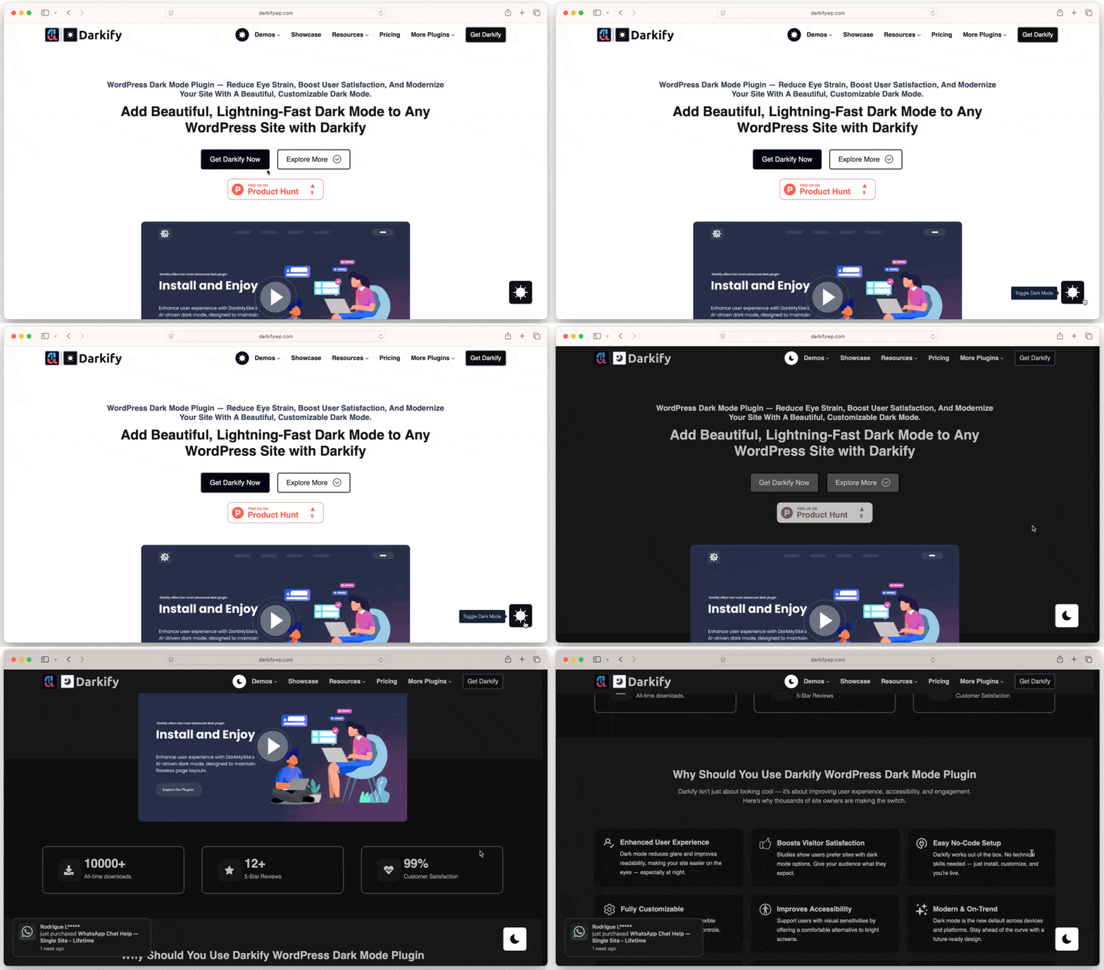
Darkify gives WordPress visitors a way to choose between light and dark presentations — that supports preference and contextual comfort, and it should not be described as a medical treatment or a proven eye-strain solution. Per its current WordPress.org listing, the free version includes a manual toggle, OS-aware detection, and basic color customization; Pro-tier controls add custom CSS and element or page-specific targeting for readers who want finer control over the presentation, not the underlying research question this article covers.
Common Myths and Mistakes
- “Dark mode is scientifically proven to prevent eye strain.” Too strong — controlled studies disagree with each other.
- “Dark mode is always better at night.” Context matters more than time of day; ambient lighting relative to screen brightness is the more consistent factor.
- “If dark mode feels better, it must be medically healthier.” Comfort and clinically measured outcomes are different things, and studies show they can point in different directions.
- “Everyone with astigmatism should avoid dark mode.” No credible research directly supports this specific, commonly repeated claim.
- “20-20-20 is the only proven solution.” Evidence for the exact schedule is mixed; the broader habit of regular breaks is better supported than the precise numbers.
- “Changing the theme fixes problems caused by six hours of uninterrupted screen use.” It doesn’t — color scheme is one variable among many.
Frequently Asked Questions
A Display Preference, Not an Eye-Care Prescription
Research doesn’t show one polarity is universally best for every eye, task, or environment. Dark mode can be comfortable and useful, particularly in dim rooms with otherwise-bright screens. Light mode can be easier to read for some people and tasks. Good website design doesn’t need an unsupported health claim to justify offering both — a well-designed choice is enough.
If you want to give WordPress visitors that choice, Darkify’s setup guide covers installation, and its documentation covers current customization options.
Disclosure: darkifywp.com is operated by ThemeAtelier, the developer of Darkify. Because we have a commercial interest in dark mode adoption, this article does not use our own marketing materials as evidence of eye-health benefits — the health and vision claims above are based on independent published research and professional eye-health sources.