A blocksy dark mode toggle looks like a five-minute job until you actually flip it on: the header keeps its old background, the off-canvas menu stays white, and a product card on the shop page turns unreadable. Blocksy gives you a lot of design control through its color palette system, header builder, and WooCommerce settings — and each of those layers needs its own pass once dark mode enters the picture.
This guide covers setting up a dark mode toggle on a Blocksy site, configuring colors so they actually look intentional, and fixing the header, mobile menu, and WooCommerce issues that tend to show up once you switch it on.
Key Takeaways
- Blocksy’s own dark mode toggle, the Colour Mode Switch, is a Blocksy Companion Pro feature and requires manually building a second color palette rather than generating one automatically.
- A dedicated plugin like Darkify adds a toggle and dark styling without requiring Blocksy Pro or a hand-built palette, plus exclusions for elements that shouldn’t change.
- Transparent headers, sticky headers, the off-canvas mobile menu, and WooCommerce checkout fields need individual testing after enabling dark mode.
- Manual CSS works for one or two isolated fixes, but is hard to maintain as the main sitewide dark mode approach on Blocksy.
- Test desktop, tablet, and mobile views, plus WooCommerce pages, before publishing dark mode to visitors.
Does Blocksy Support a Dark Mode Toggle?
Yes. Blocksy includes a native Colour Mode Switch extension, but it’s a Blocksy Companion Pro feature, and it doesn’t generate dark colors for you automatically — you build a second palette by hand. A dedicated plugin such as Darkify is the other route, adding a toggle and sitewide dark styling without requiring Blocksy Pro first.
It helps to separate three things. The Blocksy Theme controls the base layout, global colors, and header structure. Blocksy Companion (and Companion Pro) is the plugin that unlocks extensions such as the Colour Mode Switch, advanced header options, and WooCommerce refinements. A dark mode plugin like Darkify works independently of both, applying its own dark styling and toggle across the site.
The result still depends on how the individual site is built: global color settings, header transparency, background images, existing custom CSS, third-party blocks, WooCommerce templates, and caching tools can all affect the final output.
Before You Begin
- Create a full backup of your site.
- Test on a staging copy first if one is available.
- Update WordPress, Blocksy, Blocksy Companion, WooCommerce, and Darkify to their current versions.
- Clear any page or CSS caches after making styling changes.
- Note any existing custom CSS so you know what might conflict with dark mode.
- Check your most important templates before turning dark mode on sitewide.
How to Add a Blocksy Dark Mode Toggle With Darkify
Step 1: Install and Activate Darkify
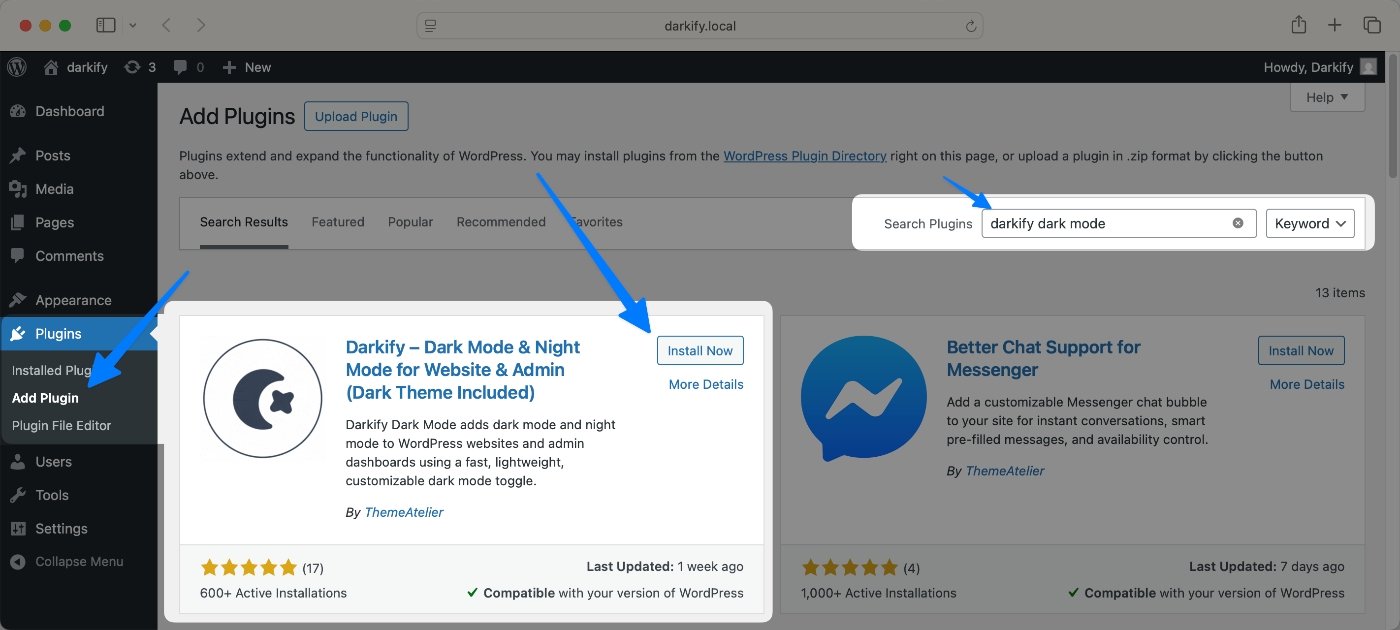
Install Darkify (free version) from the WordPress.org plugin directory, or search “Darkify” under Plugins → Add New in your dashboard. Click Install, then Activate — no separate setup wizard is required.
Step 2: Enable the Dark Mode Switch
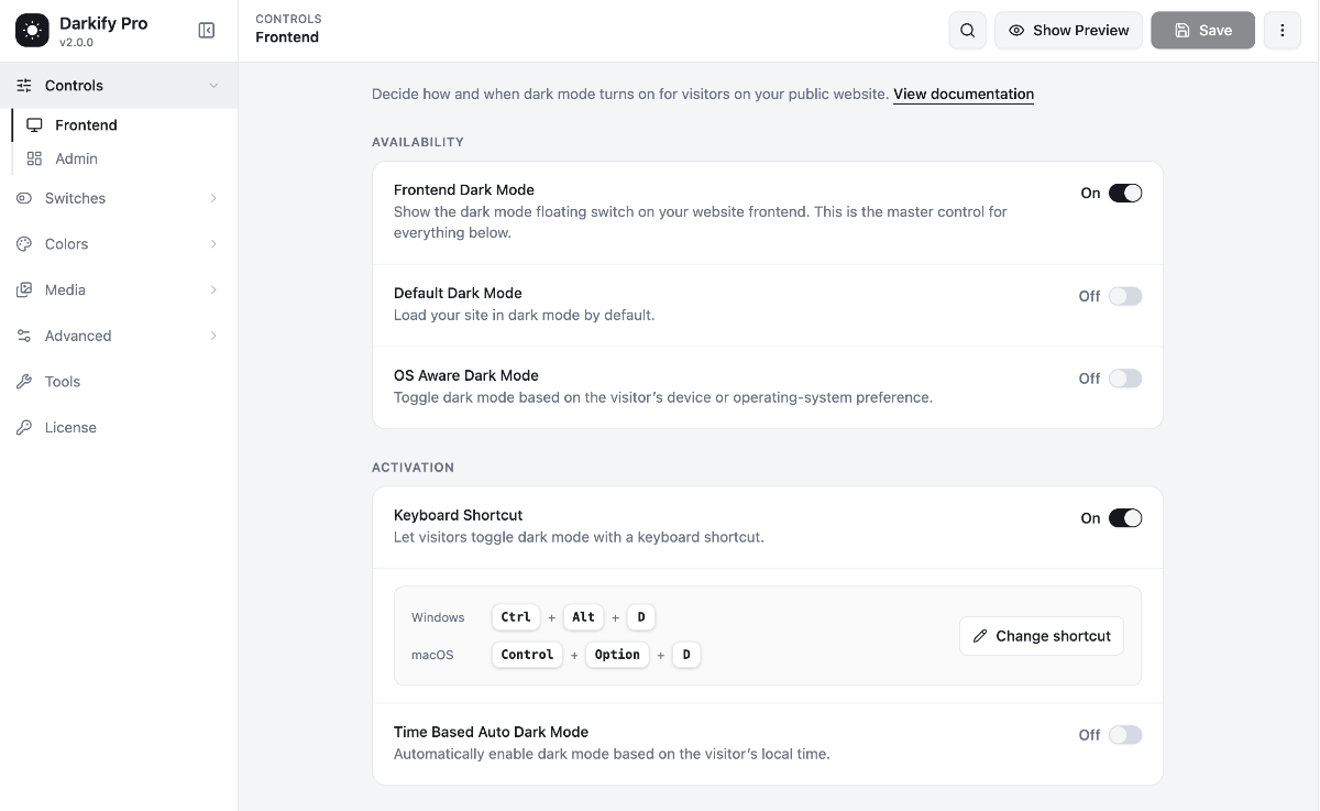
Open Darkify’s settings and flip the main Enable Dark Mode switch on. Choose a floating switch style and position — top-right, bottom-left, or another spot that doesn’t collide with the Blocksy header. Decide how it activates: manually via the switch, by OS preference, on a time schedule, or loaded by default, and set the mobile switch deliberately rather than leaving it on the desktop default.
Step 3: Review Blocksy’s Color Palette
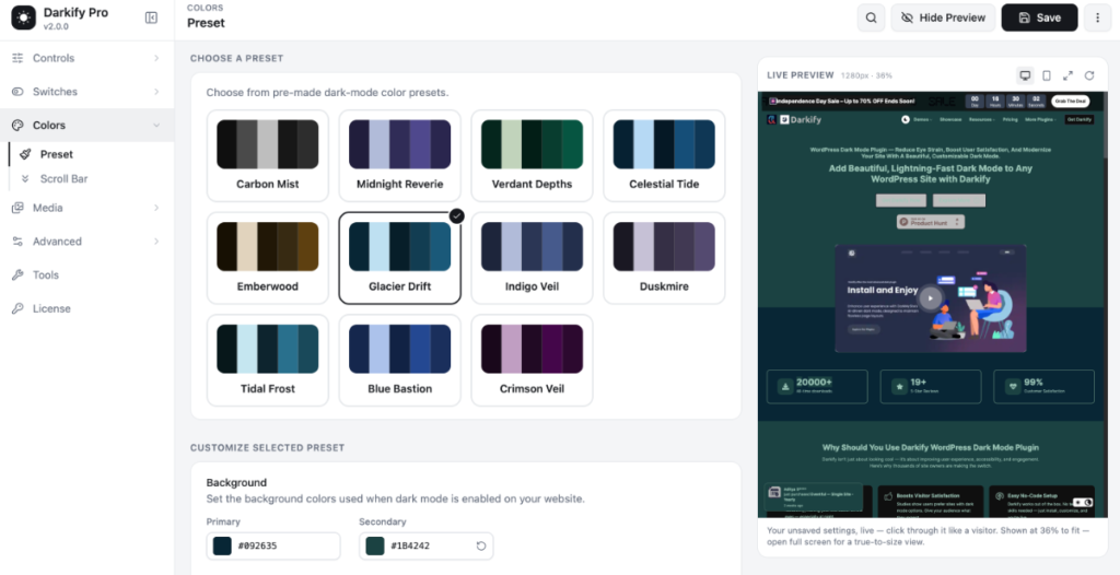
Darkify doesn’t read Blocksy’s global color palette automatically — it applies its own dark preset or a custom color set you configure. Open Customizer → Colours in Blocksy alongside Darkify’s color settings, and compare backgrounds, text, buttons, and links against what Darkify renders, adjusting until they match your brand. If you’d rather build a fully manual second palette instead, Blocksy’s own Colour Mode Switch is the Pro alternative, though it requires assigning every dark-mode color by hand.
Step 4: Test the Main Page Templates
Before rolling dark mode out to visitors, click through each of these templates with the switch on:
- Homepage
- Standard page
- Blog archive
- Single post
- Search results
- 404 page
- WooCommerce shop page
- Product page
- Cart
- Checkout
- My Account
Step 5: Refine Problem Elements
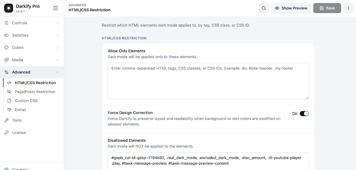
For anything that still looks wrong, use Darkify’s Allow/Disallow Elements controls to include or exclude specific HTML elements, tags, classes, or IDs — the same options exist at the page and post level too. For more precise fixes, Darkify Pro’s Custom CSS for Dark Mode option lets you write rules that apply only when dark mode is active. Selector names vary between Blocksy setups, so confirm the actual class on your site first.
Blocksy Header and Navigation Fixes
Blocksy’s transparent header takes its background from the hero section and applies based on Display Conditions you set — home page, archives, or specific pages. Its sticky header is a separate setting under Customizer → Header → Global Header, and it can stick specific rows only, with its own transition animation. That separation is exactly why a header can look right over a hero image and wrong once it goes sticky.
Work through the header in this order:
- Check the default header first, before any transparency or stickiness applies.
- If Transparency functionality is on, check it over its hero background specifically.
- Scroll to trigger the sticky state and check it again, since it’s a separate configuration.
- Check the logo in each state; many sites need separate light and dark logos.
- Check nav links, dropdown menus, search icon, account and cart icons, and any header buttons.
Where Darkify’s default styling doesn’t reach a header state, use Allow/Disallow Elements to target that section, or add a small CSS rule scoped to the header class — for example .header-transparent .item-menu — replacing the selector with whatever your site actually uses.
Blocksy Mobile Menu and Off-Canvas Panels
Blocksy’s mobile menu runs through a Trigger element that opens an Off Canvas Area, styled as either a full-screen Modal or a Side Panel that slides in from the left or right. The panel has its own background color, backdrop, shadow, and close-button styling, all separate from the desktop header — which makes it a common place a dark mode setup gets missed.
Open the panel on an actual mobile-width screen and check each of these:
- Trigger icon and its size at each device breakpoint
- Off-canvas panel background and backdrop
- Navigation text and submenu indicators
- Close button styling
- Any buttons or widgets placed in the off-canvas area
Don’t assume a clean desktop pass means the mobile menu is fine — an element hidden on desktop can still be visible, and wrong, on tablet or phone. If something in the panel should keep its original styling, exclude it with Allow/Disallow Elements instead of adjusting the whole panel.
Blocksy Design Elements and Background Images
Most Blocksy sections built from global colors — content blocks, buttons, and standard widgets — pick up dark styling without extra work. Check individually anything with a color or image set directly: hero sections, background images, gradients, and any block where a color was typed in rather than pulled from the global palette.
Text over a background image needs deliberate handling rather than automatic conversion — a toggle can’t know whether white text over a photo needs a darker overlay. Review any hero section for contrast in both modes, and adjust overlay opacity or text color directly if a dark preset doesn’t carry through.
WooCommerce and Blocksy Dark Mode
Blocksy’s WooCommerce settings, under Customize → WooCommerce, add refinements such as product thumbnails and quantity fields inside the checkout order summary, auto-highlighted required fields, and an optional privacy note near the checkout button. Darkify applies dark styling to WooCommerce pages such as product, cart, and checkout layouts, but these Blocksy-specific fields are worth checking individually since they’re added on top of WooCommerce’s default markup.
Work through these WooCommerce areas specifically:
- Product cards and sale badges
- Product prices and variation selectors
- Quantity fields and add-to-cart buttons
- Order summary thumbnails on checkout
- Required-field asterisks and validation messages
- Mini cart and cart table, including the coupon form
- Checkout fields and payment method panels
- My Account navigation
Pay attention to error, warning, success, disabled, and selected states in checkout and account forms — these need to stay visually distinguishable, not just legible. A field that no longer looks different when disabled versus active is a usability problem, not a cosmetic one.
Troubleshooting Common Blocksy Dark Mode Issues
| Problem | Likely Cause | Recommended Fix |
|---|---|---|
| Header stays in its original color over the hero image | Transparency functionality isn’t matched with a dark styling rule | Check the header state in Blocksy, then adjust or exclude via Darkify |
| Sticky header changes to the wrong color after scrolling | Sticky header is a separate configuration from the transparent state | Set sticky-state colors in Blocksy and re-test after scrolling |
| Off-canvas menu remains white | The panel’s background wasn’t included in dark styling | Target the panel with Allow/Disallow Elements or custom CSS |
| Logo becomes difficult to see | One logo is used for both light and dark states | Upload a separate dark-mode logo where supported |
| Text over a background image becomes unreadable | No overlay or contrast adjustment was set for that section | Darken the overlay, or adjust the text color directly |
| Buttons lose hover contrast | Hover state color wasn’t included in the dark preset | Adjust the button’s hover color, or add a targeted CSS rule |
| WooCommerce checkout fields remain too bright | Styling comes from a Blocksy-specific checkout refinement | Add a Custom CSS rule scoped to that element’s markup |
| Widgets retain hard-coded colors | A widget has an inline color set rather than inheriting global colors | Edit the widget’s color, or exclude it and style it manually |
| Custom CSS overrides Darkify | Existing CSS has higher specificity than the dark mode styles | Scope the rule more narrowly or align it with the dark mode class |
| Changes do not appear because of caching | A page or CSS cache is serving an old version of the styles | Clear all caches, including any CDN or optimization plugin |
When something looks wrong, work through it in this order:
- Inspect the affected element in your browser’s developer tools.
- Identify whether the color comes from Blocksy, a block, custom CSS, or another plugin.
- Check the relevant Darkify configuration.
- Apply an Allow/Disallow exclusion or a targeted CSS rule.
- Clear any caches.
- Retest across devices and templates.
Using Allow/Disallow Elements for Edge Cases
Some elements shouldn’t be recolored at all — they should be excluded and left as they are. Darkify’s Allow/Disallow Elements setting is built for this: fine-tuning which HTML elements use dark mode styling by selecting specific tags, classes, or IDs.
Common candidates for exclusion include:
- Brand logos
- Product photography
- Embedded maps
- Payment badges
- Promotional banners that are already designed dark
- Images that contain their own text
- Third-party widgets that manage their own color system
To find the right class or ID, right-click the element and choose Inspect — the class name appears in the developer tools panel, no coding experience required. Enter the narrowest selector that matches just that element rather than a broad class shared across the page, since an overly wide exclusion can quietly turn off dark mode somewhere you didn’t intend.
Manual CSS vs. Darkify
| Factor | Manual CSS | Darkify |
|---|---|---|
| Setup time | Slower — every section is styled by hand | Faster — sitewide styling applied from presets or custom colors |
| Technical knowledge | Requires CSS knowledge | Usable without writing CSS for most sites |
| Sitewide consistency | Depends entirely on how thorough the CSS is | Consistent by default, refined with exclusions where needed |
| Maintenance | Every new page or block may need new rules | New content generally inherits existing dark styling |
| Dynamic content | Hard to keep up with WooCommerce and plugin updates | Built-in WooCommerce styling reduces ongoing upkeep |
| User-controlled switching | Requires custom scripting to add a toggle | Switch, scheduling, and OS-based activation included |
| Edge-case control | Full control, but manual for every case | Allow/Disallow Elements and Custom CSS handle exceptions |
Manual CSS is reasonable for fixing one or two isolated components, but tends to fall behind once WooCommerce, plugins, and new blocks get added. For a Blocksy site with a real header, mobile menu, and store to manage, Darkify plus a small amount of targeted CSS is usually more maintainable — and doesn’t require Blocksy Companion Pro to get a working toggle.
Blocksy Dark Mode Testing Checklist
Run through this checklist before publishing dark mode to real visitors:
- Desktop, tablet, and mobile screens
- Header before and after scrolling
- Light and dark logos
- Navigation menus and dropdowns
- Off-canvas mobile menu
- Blog and archive pages
- Forms and validation messages
- WooCommerce pages
- Hover, focus, active, selected, and disabled states
- Text-over-image contrast and accessibility
- Multiple browsers and devices
- Cache-cleared and incognito testing
Final Recommendation
Getting a Blocksy dark mode toggle right comes down to testing the parts of the site that don’t automatically follow a sitewide switch: the transparent and sticky header states, the off-canvas mobile menu, and the WooCommerce checkout fields Blocksy adds on top of the default templates.
If you’re adding dark mode for the first time, start with Darkify Free. Once you need Custom CSS or finer element-level control, Darkify Pro covers that layer. For setup help, the Darkify documentation walks through each setting.