

Introduction: Why Accessibility Matters in WordPress Design
Dark mode accessibility in WordPress is more important than ever as modern websites race to keep up with user preferences for sleek, low-light interfaces. From social media platforms to mobile apps, dark mode has become a standard design option—and WordPress users are no exception.
But while dark mode can enhance user experience by reducing eye strain and saving battery life, it can also unintentionally create accessibility issues if not implemented thoughtfully. Low contrast, poor typography, and unreadable elements can alienate users with visual impairments or sensitivity to certain lighting conditions.
In this post, we’ll explore how to make dark mode WordPress sites more accessible, covering essential best practices, contrast ratios, recommended tools, and how plugins like Darkify can help strike the perfect balance between aesthetic appeal and inclusive design.
Table of Contents
What Is Accessibility in WordPress?
Accessibility in WordPress means designing and developing websites so that everyone can use them, regardless of ability. This includes people with visual impairments, cognitive challenges, mobility limitations, or users who rely on screen readers and keyboard navigation.
The most common standard for web accessibility is the Web Content Accessibility Guidelines (WCAG), created by the W3C. In some countries like the U.S., ADA compliance (Americans with Disabilities Act) also requires public-facing websites to meet accessibility standards.
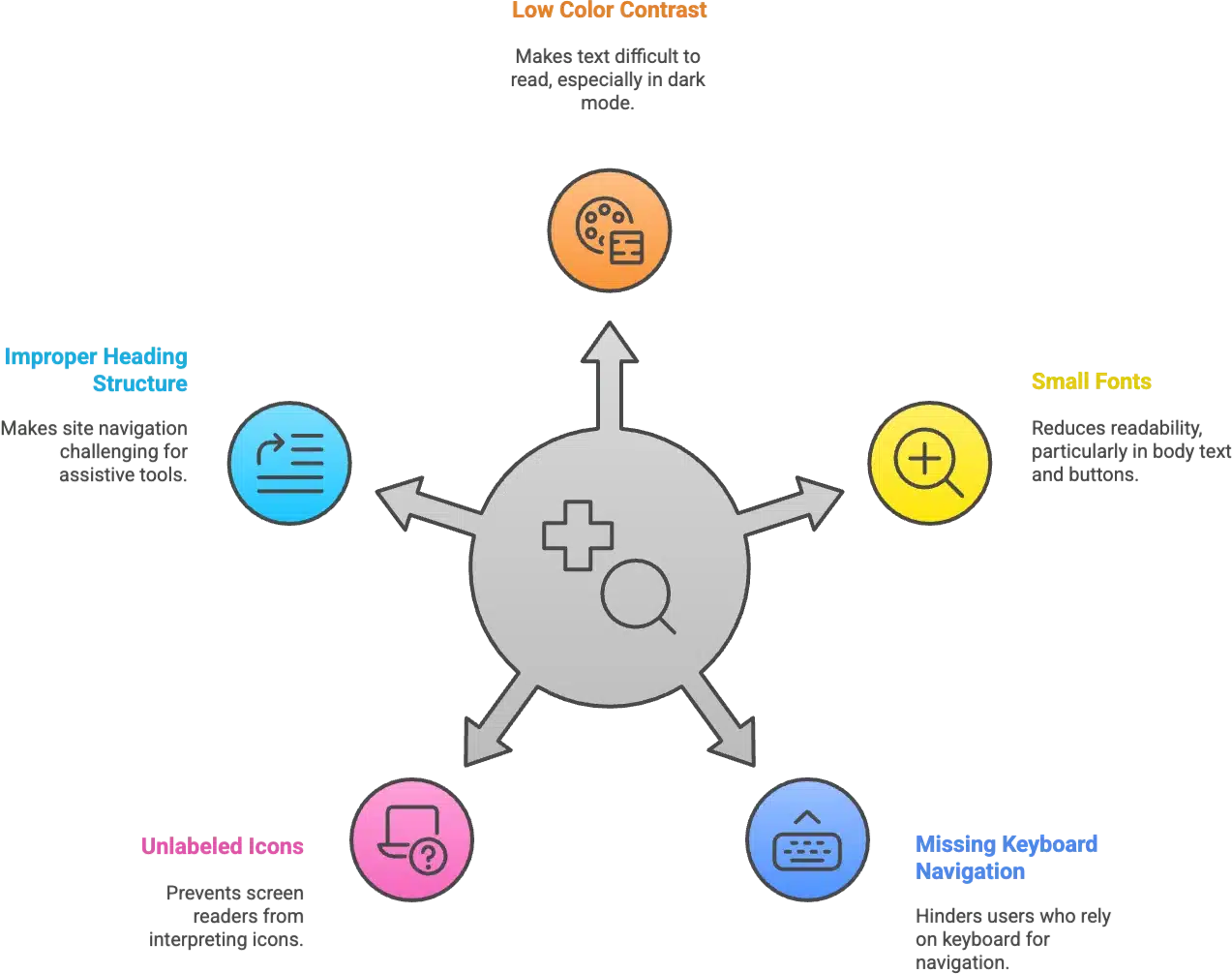
Here are a few key accessibility concerns you should watch for in your WordPress site:
- Low color contrast between text and background (especially critical in dark mode).
- Small or poorly readable fonts, particularly in body text or buttons.
- Missing keyboard navigation support — essential for users who don’t use a mouse.
- Unlabeled icons or buttons, which screen readers can’t interpret.
- Improper heading structure, making it hard to navigate via assistive tools.
Whether you’re running a blog, store, or portfolio site, accessible design ensures you don’t exclude visitors who may experience the web differently. That’s why dark mode accessibility in WordPress isn’t just a nice-to-have—it’s a critical part of inclusive design.
The Rise of Dark Mode – Pros & Pitfalls for Accessibility
Dark mode accessibility in WordPress is increasingly becoming a topic of concern—not because dark mode is a bad idea, but because when done wrong, it can create barriers for users instead of breaking them down.
✅ Benefits of Dark Mode
- Reduces eye strain in low-light environments, especially during nighttime browsing.
- Preferred by many users, particularly developers, designers, and frequent readers.
- Improves battery life on OLED and AMOLED screens by using less power to display darker pixels.
- Modern aesthetic — dark mode is often perceived as more sleek and tech-forward.
⚠️ Pitfalls for Accessibility
- Poor color choices (like dark gray on black or bright neon text) can make content unreadable.
- Low contrast ratios between text and background fail WCAG standards, excluding visually impaired users.
- Theme or plugin limitations — not all WordPress themes or dark mode plugins (even popular ones) respect accessibility best practices.
- Inconsistent UX — switching from light to dark without preserving design clarity leads to confusion or discomfort.
While dark mode in WordPress is stylish and user-friendly for many, you must approach it with accessibility in mind. Otherwise, the same feature meant to help users can unintentionally harm their experience.
Dark Mode Accessibility in WordPress – Key Considerations
When designing or enabling dark mode accessibility in WordPress, it’s essential to go beyond aesthetics and ensure your site remains usable for everyone. Here are the most important elements to check:
🌓 Color Contrast Compliance
Maintaining strong color contrast is one of the most critical aspects of accessibility in dark mode.
- Use tools like WebAIM Contrast Checker ✅ to test text and background combinations.
- Follow WCAG 2.1 guidelines:
- AA compliance: 4.5:1 ratio for body text.
- AAA compliance: 7:1 for enhanced readability.
- Don’t rely on your eyes—what looks “fine” may fail for people with visual impairments.
🔤 Typography & Readability
Dark backgrounds can make poorly styled text harder to read. Keep text legible by focusing on:
- Avoiding light gray text on black or very dark backgrounds — it can blur or fade out.
- Using minimum 16px font size for body text.
- Maintaining proper line height (1.5x) and letter spacing for better reading flow.
- Choosing sans-serif fonts for clarity on screens.
🔘 Form Elements & Buttons
Forms and CTAs are often neglected in dark mode, but they’re vital for usability.
- Ensure input fields and buttons are clearly visible and labeled.
- Avoid transparent borders or box shadows that disappear in dark backgrounds.
- Apply accessible focus states (visible outlines when tabbing).
- Ensure labels remain legible in both light and dark modes.
🖼️ Images & Icons
Dark mode can make images and icons disappear if not handled properly.
- Avoid logos or icons that blend into the background (e.g., black logos on dark gray).
- Use SVGs with adaptive colors or load alternate images for dark mode.
- Make sure icons used in navigation or buttons maintain sufficient contrast.
How to Test WordPress for Dark Mode Accessibility
Ensuring dark mode accessibility in WordPress isn’t just about enabling a dark theme—it’s about validating that your site is usable for everyone, including users with visual or cognitive impairments. Here’s a practical checklist to test your WordPress site for accessibility in dark mode:
✅ 1. Enable Dark Mode First
Turn on dark mode using your theme or a plugin like Darkify. Make sure it affects the full frontend experience (and optionally the backend if you support admin dark mode).
🎧 2. Use Screen Readers
Test your site with screen readers like:
- NVDA (Windows)
- VoiceOver (macOS/iOS)
- TalkBack (Android)
Check that all content remains navigable and properly labeled. Dark mode should not impact semantic structure or ARIA labels.
⌨️ 3. Test Keyboard Navigation
Make sure users can:
- Navigate using the Tab key
- See visible focus indicators
- Access menus, forms, and toggles without a mouse
Dark mode sometimes hides focus outlines—so validate that these are still visible.
🌓 4. Use Contrast Checker Tools
Evaluate contrast for all text, buttons, and form elements using tools like:
- WebAIM Contrast Checker
- Axe DevTools browser extension
Aim for WCAG AA or AAA compliance, especially on text and interactive elements.
📱 5. Test on Multiple Devices
Try your dark mode WordPress site on:
- Mobile devices (iOS, Android)
- Tablets and desktops
- Under varied screen brightness and ambient lighting
What looks good on a bright monitor may be unreadable on a dim phone screen.
Dark Mode Plugins with Accessibility in Mind
When implementing dark mode accessibility in WordPress, the plugin you choose can make or break the user experience—especially for users with visual sensitivities or disabilities. Thankfully, a few plugins are built with accessibility in mind.
✅ Darkify – Built for Accessibility & Performance
Darkify is one of the most thoughtful dark mode plugins for WordPress users who care about both design and accessibility. Here’s why it stands out:
- Frontend + Admin Support: Toggle dark mode not just on the public site, but also in the WordPress dashboard and login screen.
- Customizable Contrast & Colors: Choose background, text, icon, and toggle colors to ensure WCAG-compliant contrast ratios.
- Mobile & Retina-Ready: The toggle is responsive and optimized for high-DPI displays, maintaining clarity on every device.
- No Coding Required: Beginners can enable and test accessible dark mode with just a few clicks.
🆚 What About WP Dark Mode?
While WP Dark Mode also provides dark theme functionality, many of its advanced accessibility features (like toggle placement, image/logo switching, etc.) are locked behind a Pro version. It’s a decent option—but Darkify offers more flexibility out of the box for accessibility-conscious users.
💡 Pro Tip: Always Test with Real Content
Don’t just test dark mode on empty pages or demo content. Use your actual site pages—blog posts, product pages, contact forms—and verify:
- Readability
- Navigation
- Visual contrast
- Image and icon visibility
Accessibility should never be an afterthought. The right plugin, like Darkify, helps you build an inclusive WordPress site from day one.
FAQs – Dark Mode Accessibility in WordPress
-
Does dark mode improve accessibility?
Dark mode can improve accessibility for some users, especially those with light sensitivity or visual fatigue. However, poor implementation—like low contrast or unreadable text—can make things worse. That’s why accessibility testing is critical.
-
What contrast ratio is required for accessibility?
According to the WCAG (Web Content Accessibility Guidelines):
– AA level: Minimum contrast ratio of 4.5:1 for normal text and 3:1 for large text.
– AAA level: Higher standard with 7:1 for normal text and 4.5:1 for large text.
Use tools like WebAIM Contrast Checker to verify compliance. -
Can I make my custom dark mode ADA compliant?
Yes, but it requires careful attention to contrast, typography, and navigation. Use accessible color palettes, maintain focus outlines for keyboard users, and ensure form elements are clearly visible. Testing across devices is a must.
-
Are dark mode plugins bad for accessibility?
Not necessarily. Some plugins, like Darkify, are designed with accessibility in mind—offering customization options to meet WCAG standards. Others may prioritize visual effects over usability. Always test before going live.
-
How can I test my site’s accessibility in dark mode?
Here are a few essential steps:
– Use screen readers (like NVDA, VoiceOver)
– Navigate using only the keyboard
– Use contrast checking tools (WebAIM, Axe, Lighthouse)
– Test in both light and dark mode across multiple devices
– Don’t forget to include forms, buttons, and custom content
Final Thoughts
Dark mode accessibility in WordPress is about more than just style — it’s about creating an inclusive, comfortable experience for all users.
By striking the right balance between aesthetics and usability, you ensure that dark mode doesn’t just look great, but also functions well for people with visual impairments or sensitivity to bright screens.
✅ Recap:
- Prioritize contrast and legibility
- Choose dark mode tools that allow customization
- Test across devices, screen readers, and browsers
If you’re already using dark mode, now’s the time to audit your setup for accessibility. If not, start smart by using a plugin like Darkify, which is lightweight, customizable, and accessibility-friendly.