

Color Presets #
The Colors settings allow you to define how your website looks in Dark Mode. You can start with a preset and then fine-tune the background, text, inputs, borders, and buttons to match your brand.
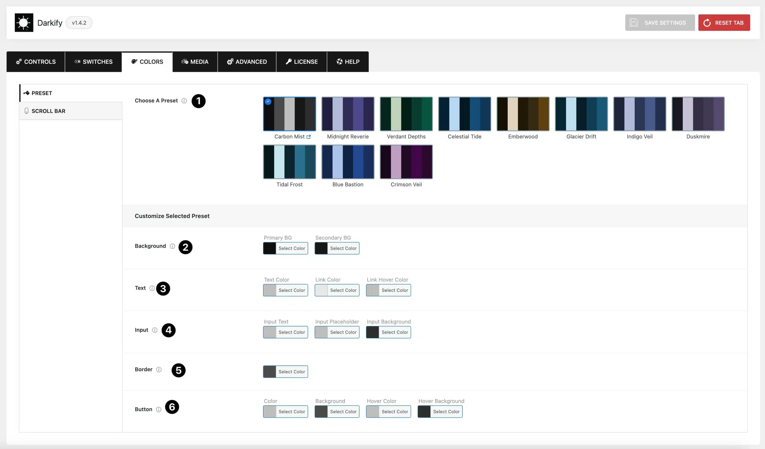
- Choose a Preset: Select from a range of pre-designed dark mode color schemes (e.g., Carbon Mist, Midnight Reverie, Verdant Depths, Celestial Tide).
Each preset provides a quick way to apply a consistent dark theme across your site. - Background: Set the primary and secondary background colors for your site in dark mode.
- Text: Customize text colors including:
- Text Color – General body text
- Link Color – Default link color
- Link Hover Color – Link color on hover
- Input: Define the appearance of input fields in dark mode:
- Input Text – Text color inside inputs
- Input Placeholder – Placeholder text color
- Input Background – Background color for input fields
- Border: Set the border color for site elements (useful for input fields, boxes, or card outlines).
- Button: Customize button styles in dark mode:
- Color – Button text color
- Background – Button background color
- Hover Background – Background color on hover
- Hover Color – Text color on hover
Dark Mode Scrollbar #
Darkify also lets you apply dark mode styling to your website’s scrollbar, creating a consistent look across the entire browsing experience.
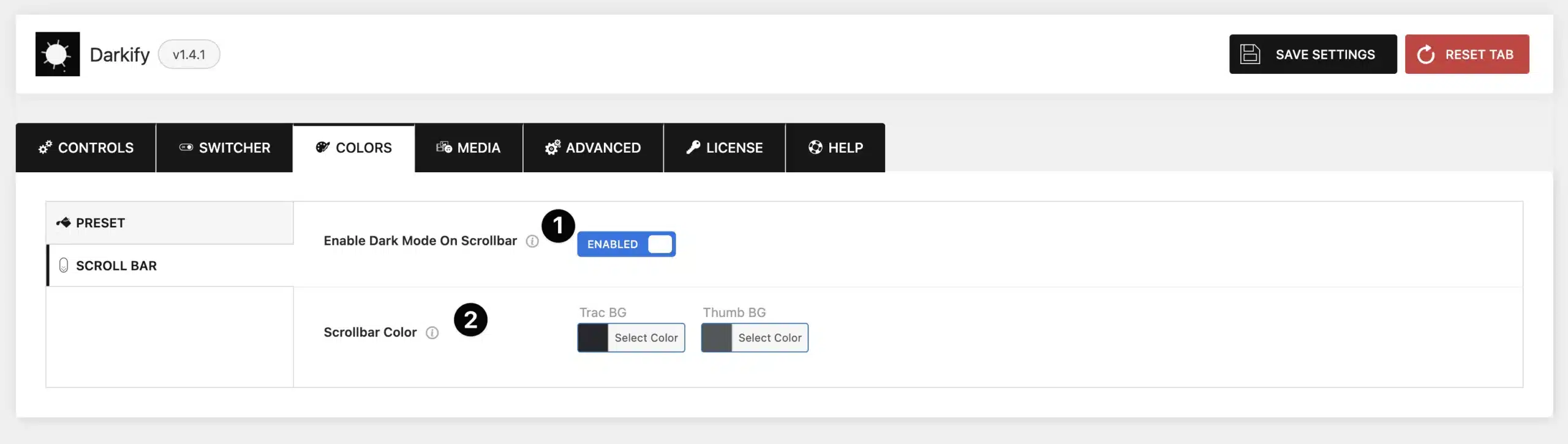
- Enable Dark Mode on Scrollbar: Toggle this option to apply dark mode styling to the website scrollbar.
- Scrollbar Color: Customize the colors of the scrollbar elements:
- Track BG – The background of the scrollbar track (the path).
- Thumb BG – The draggable thumb that users move to scroll.


