

Switcher Customization #
The Switcher Customization settings let you control the look and behavior of the Dark Mode toggle switch that appears on your website.
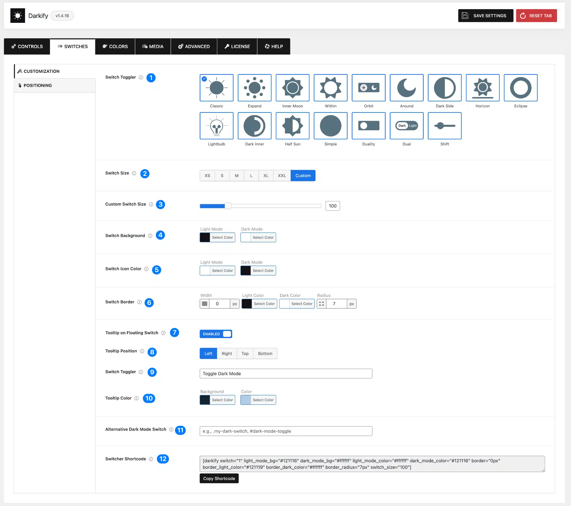
Switch Appearance #
- Switch Toggler: Choose from multiple switch designs (Classic, Expand, Inner Moon, Around, Dark Side, Horizon, etc.) to match your site’s style.
- Switch Size: Choose a pre-defined size for the floating toggle switch, or select Custom to define your own size.
- Custom Switch Size: Set a custom value to resize the floating switch.
- Switch Background: Set the background colors of the switch for both Light Mode and Dark Mode.
- Switch Icon Color: Define separate icon colors for Light Mode and Dark Mode.
- Switch Border: Customize the border width, border color (Light and Dark), and corner radius of the switch.
Tooltips #
- Tooltip on Floating Switch: Enable this option to show a tooltip (hint text) when users hover over the floating switch.
- Tooltip Position: Choose where the tooltip appears — Left, Right, Top, or Bottom.
- Tooltip Text: Enter custom text for the tooltip (e.g., “Toggle Dark Mode”).
- Tooltip Color: Define the background and text color for the tooltip.
Advanced Options #
- Alternative Dark Mode Switch: Enter comma-separated CSS selectors (class or ID) of elements you want to act as dark mode switches. Example:
.custom-switch, #header-toggle. - Switcher Shortcode: Use the generated shortcode to place the Dark Mode switch anywhere on your site (posts, pages, widgets, Elementor, Gutenberg, etc.).
- The shortcode supports customization options such as size, colors, icon colors, and border styles.
- Example:
[darkify switch="1" light_mode_bg="#121116" dark_mode_bg="#ffffff" light_mode_color="#ffffff" dark_mode_color="#121116" border="0px" border_light_color="#121119" border_dark_color="#ffffff" border_radius="7px" switch_size="100"]Switcher Positioning #
The Switcher Positioning settings let you control where the Dark Mode toggle switch appears on the screen for both desktop and mobile devices.
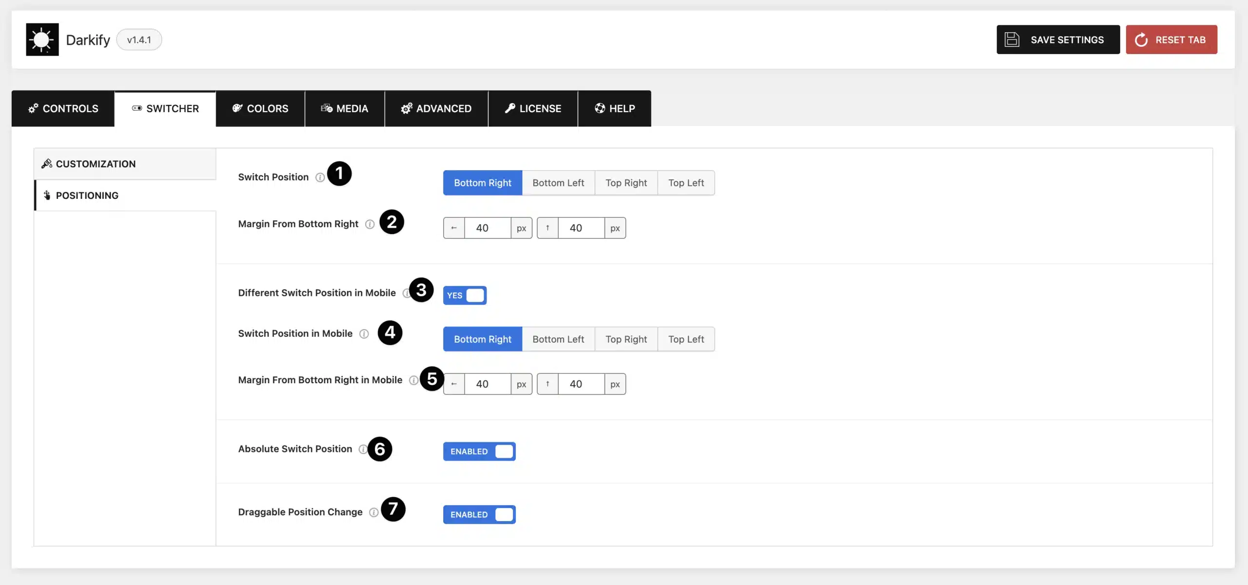
- Switch Position: Choose the screen position of the floating switch: Bottom Right, Bottom Left, Top Right, or Top Left.
- Margin from Position: Adjust the horizontal and vertical margins (in pixels) from the chosen corner. This ensures the switch does not overlap with other site elements.
- Different Switch Position on Mobile: Enable this if you want the switch to appear in a different position on mobile devices.
- Switch Position in Mobile: Select where the switch should appear on mobile (Bottom Right, Bottom Left, Top Right, Top Left).
- Margin on Mobile: Adjust the margins for the switch when displayed on mobile devices.
- Absolute Switch Position: When enabled, the switch remains fixed relative to the page content and moves with scrolling.
- If disabled, the switch stays in a fixed position on the screen regardless of scrolling.
- Draggable Position Change: Allow users to drag the switcher and reposition it anywhere on the screen.


