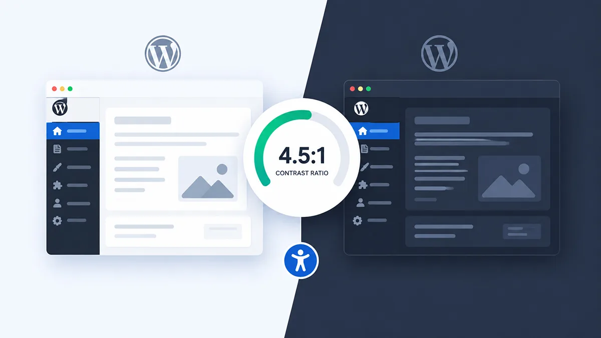
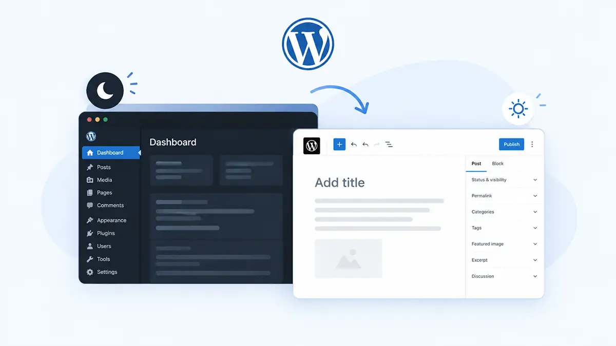
You flip the WordPress dashboard to dark, everything looks great, and then you open a post to edit it — and the writing canvas is still a sheet of white. That’s the part most WordPress admin dark mode guides skip. The dashboard and the editor aren’t one interface, and darkening one doesn’t darken the other. This guide covers what’s actually happening, what WordPress core does and doesn’t ship today, and how to get both surfaces dark without wrecking readability.
Key Takeaways
- WordPress core still ships no admin dark mode. WordPress 7.1 added design-token infrastructure that makes one possible later, not the feature itself.
- The dashboard and the block editor canvas are separate styling contexts, so a rule that darkens wp-admin can leave the writing canvas white.
- Admin color schemes aren’t dark mode. Midnight and Ectoplasm recolor the menu and accents while content areas stay light.
- Dark mode isn’t universally easier to read. In controlled studies, light backgrounds won on visual acuity and proofreading (Nielsen Norman Group, 2020).
- Computer vision syndrome has a pooled prevalence of 69.0% across 103 studies and 66,577 participants (Journal of Optometry, 2023) — but screen time and posture drive that, not background color alone.
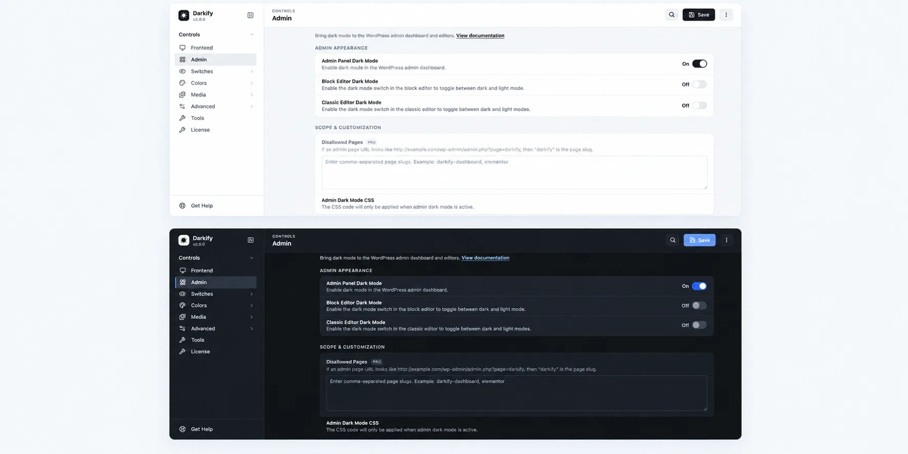
- Darkify treats Admin Panel, Block Editor, and Classic Editor as three separate toggles in its free version, which is the structure this problem actually needs.
Does WordPress Have a Built-In Admin Dark Mode?
No. As of WordPress 7.1, released in 2026, core still doesn’t ship a dark mode for wp-admin. What it does ship is groundwork. The Design System Theming in WordPress 7.1 post by Andrew Duthie, published July 2026, describes a new wp-theme stylesheet carrying “a full set of semantic design tokens formatted as CSS custom properties.”
Those tokens matter because they’re the missing piece. You can’t theme an interface that hardcodes its colors in a thousand places. In 2026, WordPress 7.1 applied that token system to the @wordpress/ui component library and to the user’s preferred color scheme in the Site Editor, with the stated plan to expand it across more of the admin in later releases.
So a native dark mode is plausible eventually. It isn’t here now, and nothing in that announcement commits to a release. If you want a dark dashboard today, you’re choosing between a plugin and your own CSS.
Admin Color Schemes Aren’t Dark Mode
WordPress has shipped admin color schemes since 3.8, and Midnight is the one people mistake for dark mode. Open Users → Profile and you’ll find it. It darkens the admin menu and changes accent colors — and that’s the extent of it.
The list tables, the metaboxes, the settings pages, and the post editor all stay white. That’s a themed sidebar sitting next to a bright content area, which is arguably worse for contrast comfort than plain light mode, because your eyes keep re-adapting as they move across the screen.
Why the Dashboard and the Editor Are Two Different Problems
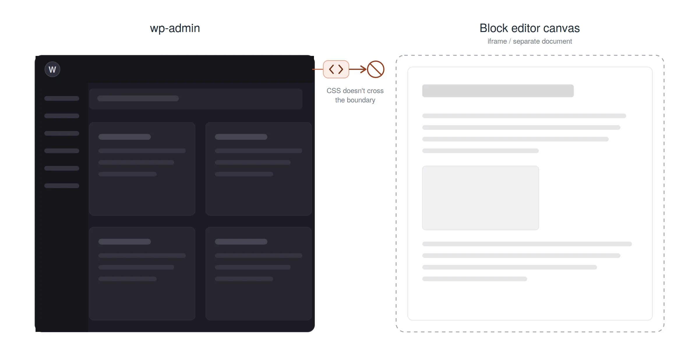
Here’s the technical reason your dashboard goes dark while the editor doesn’t. As of WordPress 7.1, the post editor canvas is always rendered inside an iframe. An iframe is a separate document. CSS applied to the surrounding wp-admin page doesn’t reach into it.
That single fact explains most of the “my admin is dark but Gutenberg is white” reports. A snippet that sets a dark background on body.wp-admin works perfectly on the dashboard, list tables, and settings screens. It never touches the canvas, because the canvas isn’t in that document at all.
WordPress documents two hooks that split along the same line. enqueue_block_editor_assets loads assets for the editor interface — the toolbar, sidebar, and surrounding chrome. enqueue_block_assets is the content-facing hook, and it reaches both the front end and the iframed canvas.
Most DIY tutorials reach for the first hook, because its name sounds right. Then they wonder why the canvas stayed bright. If you’re writing your own admin dark CSS, that hook choice is the difference between a working setup and an afternoon of debugging.
The Classic Editor Is a Third Context
Running Classic Editor? TinyMCE also renders its content area in an iframe, and it loads its own editor stylesheet. So a WordPress install can realistically have three surfaces needing separate treatment: the admin chrome, the block editor canvas, and the Classic Editor content frame.
Is Admin Dark Mode Actually Better for Your Eyes?
Honestly? Not in the way most plugin marketing implies. In 2020, the Nielsen Norman Group’s Dark Mode vs. Light Mode: Which Is Better? reviewed the academic literature and reported that light mode won on both visual-acuity and proofreading tasks for users with normal vision, across age groups.
That finding gets left out of nearly every dark mode sales page, so it’s worth stating plainly. Reading performance on dark backgrounds was measurably worse in controlled testing, and the advantage for light backgrounds grew as font size shrank. Participants didn’t notice the difference — they rated both modes similarly readable while performing better in one.
There’s a second wrinkle. Light text on a dark background can produce halation for people with astigmatism, where bright glyphs appear to bleed into the dark field and look fuzzy or shimmery. Level Access covers this in its accessibility guidance, and it’s a real reason some editors find dark interfaces harder, not easier.
What the Eye Strain Data Actually Says
In 2023, a systematic review and meta-analysis in the Journal of Optometry pooled 103 cross-sectional studies covering 66,577 participants and found a computer vision syndrome prevalence of 69.0% (95% CI: 62.2 to 75.4). Digital eye strain is genuinely widespread among people who work on screens all day.
But that review attributes symptoms to screen exposure duration, viewing distance, blink rate, and working conditions. It isn’t evidence that switching your dashboard background from white to charcoal prevents eye strain. Breaks, distance, and display brightness do more measurable work than palette choice.
So why bother at all? Because NN/g’s own recommendation, despite its performance findings, is that designers should let users switch. Preference is a legitimate reason on its own — and for admin work specifically, there are practical reasons that have nothing to do with eye health.
The Real Case for Darkening the Editor Too
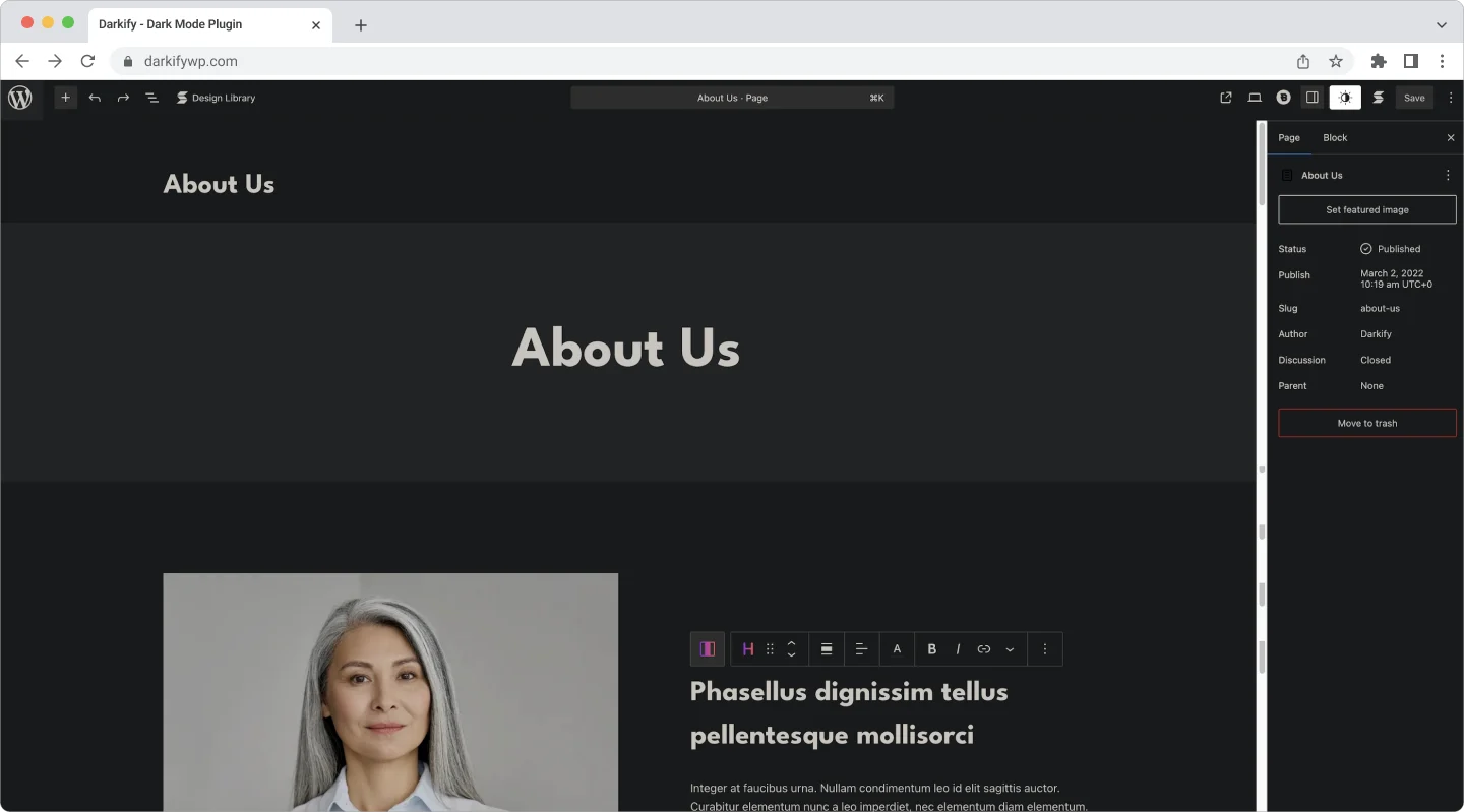
The strongest argument is design accuracy. If the site you’re building runs dark on the front end — and dark mode adoption keeps climbing across the web — then editing its content on a blinding white canvas means you’re previewing every block in a color context the visitor will never see.
Contrast decisions made against white don’t transfer. A muted grey caption that reads fine on the editor canvas can vanish on the published dark page. Editing in the same polarity as the output catches that before publication instead of after.
Then there’s the re-adaptation cost. Moving between a dark dashboard and a white editor forces your pupils to adjust every time you open a post. A half-dark admin is the worst of both — a bright rectangle punched into a dark interface, dozens of times a session.
Night sessions matter too. NN/g’s summary of the glanceable-reading research found the light-mode advantage was strongest at night for small text, which cuts against dark mode on legibility grounds — but a bright full-screen editor in a dark room is still uncomfortable at a raw brightness level. Lowering display brightness and dropping the interface polarity together is a more sensible fix than either alone.
What Usually Breaks in a Dark WordPress Admin
Every admin screen you see comes from somewhere: core, your theme, or one of your plugins. Core screens are consistent and predictable. Plugin settings pages are where dark mode gets messy, because each vendor styles its own admin UI with no shared contract.
Here’s what to check first on a real install rather than assuming a blanket toggle handled everything.
| Admin Area | Common Dark Mode Issue | What To Do |
|---|---|---|
| Core dashboard, list tables, settings | Usually adapts cleanly | Spot-check only |
| Block editor canvas | Stays light — separate document | Enable the editor toggle explicitly |
| Classic Editor / TinyMCE | Content frame keeps its own stylesheet | Enable its own toggle |
| Media library thumbnails | Transparent PNGs and white logos disappear | Exclude or adjust image handling |
| Analytics charts and graphs | Chart canvas keeps a hardcoded white fill | Exclude the container |
| Code editors (CodeMirror, Ace) | Syntax colors clash or double-darken | Exclude and use the tool’s own theme |
| Color pickers and swatches | Swatches shift, misrepresenting real values | Exclude — color accuracy matters here |
| Plugin admin screens with custom branding | Unpredictable per vendor | Test each one you actually use |
| Embedded iframes (payment, mapping, live preview) | Cross-origin content won’t inherit styling | Accept, or exclude the surrounding frame |
Notice how many rows say “exclude.” That’s the practical shape of a good admin dark mode setup: broad coverage, plus a short list of areas deliberately left alone because color accuracy or third-party styling makes darkening them a downgrade.
How To Set Up WordPress Admin Dark Mode With Darkify
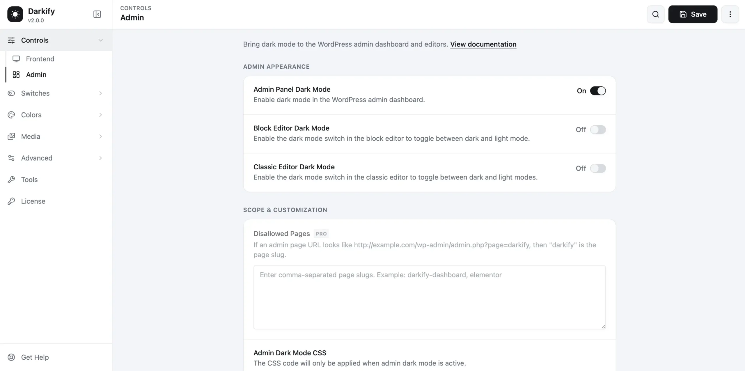
Darkify’s free version — version 2.1.1 as of August 2026, tested up to WordPress 7.1 and rated 4.8 from 22 reviews on WordPress.org — exposes the admin panel, block editor, and Classic Editor as three independent toggles rather than one blanket switch. Given the iframe split described above, that separation isn’t a nicety. It’s the correct model.
The setup path is short:
- Install and activate Darkify from the WordPress.org plugin directory.
- Open Darkify → Controls and enable Admin Panel Dark Mode.
- Enable Block Editor Dark Mode separately — the dashboard toggle doesn’t cover the canvas.
- Enable Classic Editor Dark Mode if you or your clients still use it.
- Open a real post, not a blank draft, and check headings, links, captions, and any custom blocks.
- Walk your most-used plugin settings screens. That’s where problems live.
- Check the Media Library grid for transparent logos that turned invisible.
- Use Darkify → Colors to adjust the admin and block editor presets if any surface reads too flat.
- Add exclusions for charts, code editors, and color pickers using the element-level controls.
Both the admin and block editor color presets default to Auto. Rather than forcing one background and one text color everywhere, Auto derives a shade per color on screen, which is why unfamiliar plugin admin pages tend to come out readable without being configured first. Darkify’s documentation also lists a Disallowed Pages control for backend screens you want kept in light mode permanently.
One Detail Worth Knowing
Darkify’s WordPress.org listing states that it bundles Dark Reader, the MIT-licensed library, to render dark mode in the WordPress admin. It runs in the browser on pages you’re already viewing and makes no network requests of its own. If you’ve wondered why plugin screens the developer never tested still come out readable, that’s the mechanism.
What’s Free and What’s Pro?
Everything above is free. Per the plugin’s WordPress.org listing in 2026, the free version covers frontend dark mode, admin dashboard dark mode, editor-specific dark mode for both editors, admin and block editor color presets, OS-aware detection, time-based scheduling, a Ctrl + Alt + D keyboard shortcut, five switch designs, five dark color presets, and element-level include/exclude rules.
Pro is where the targeting and media work gets finer. It adds 16+ switch designs, draggable switch positioning, expanded color preset customization for links, borders, form fields and buttons, dark-mode-only custom CSS, image inversion, image and video replacement, and per-page and per-post allow/disallow rules.
For an admin-only dark mode setup, the free version is genuinely enough. Pro earns its place when the front end needs asset-level control — swapping a dark logo, replacing hero imagery, or excluding a checkout page.
Keep It Accessible, Not Just Dark
Dark backgrounds don’t exempt you from contrast requirements. WCAG 2.2 Success Criterion 1.4.3 asks for a contrast ratio of at least 4.5:1 for body text and 3:1 for large text — the same in dark mode as in light. Mid-grey text on charcoal is the most common failure, and it’s easy to ship without noticing.
Pure white on pure black is the other extreme, and it’s the combination most likely to trigger halation. Slightly softened values — an off-white around #E6E6E6 on a near-black around #16181C — hold well past 4.5:1 while reducing that glow.
Most importantly, keep it optional. If you manage a multi-author site, don’t force every editor into a dark admin because you prefer one. Given the astigmatism and legibility findings, some of your writers will genuinely work better in light mode — and NN/g’s core recommendation was always to offer the switch, not to pick a side for everyone.
Frequently Asked Questions
Darken Both Surfaces, Not Just One
A dark dashboard with a white editor is a half-finished job, and it’s the most common outcome of following generic wordpress admin dark mode advice. The dashboard, the block editor canvas, and the Classic Editor are three separate rendering contexts, and each needs to be addressed on its own terms.
Do it because you prefer it, or because you’re building a dark-themed site and want the canvas to match the output — not because a plugin page promised your eyes would thank you. Then check contrast, exclude the screens where color accuracy matters, and leave the choice with each user on your team.