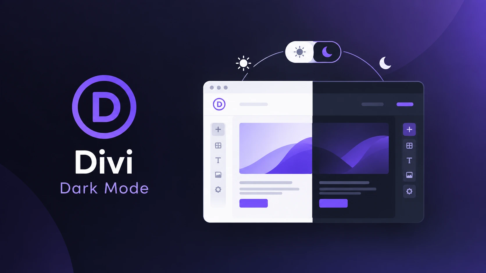
A Divi layout carries color at more levels than most builders — section, row, column, module, module state, and whatever a Theme Builder template adds on top. A carefully tuned gradient hero, a white logo in a sticky header, and a Blurb card with its own light background can all live on the same page. That’s what makes divi dark mode riskier than a simple plugin install: a global treatment can quietly wreck any one of them. This guide is a compatibility check, not an install tutorial.
Key Takeaways
- Divi 5’s Visual Builder has a light/dark interface toggle, but it only changes the editing experience — it doesn’t apply dark mode to your published site.
- Divi 5’s Global Colors and Design Variables centralize color values for easier updates, but they don’t provide visitor-facing theme switching on their own.
- Module-level compatibility varies: text and buttons often adapt with minor tweaks, while photography, brand icons, and gradients usually need deliberate handling.
- Theme Builder templates — header, footer, blog, archive — need their own QA pass; a correct page body doesn’t guarantee a correct header.
- Divi’s generated CSS can cache, so a change that looks wrong on the frontend sometimes needs a cache clear before you assume it’s broken.
- Darkify officially lists Divi compatibility, but a heavily customized layout still deserves a module-by-module review, not a blanket assumption.
Does Divi Have Built-In Dark Mode?
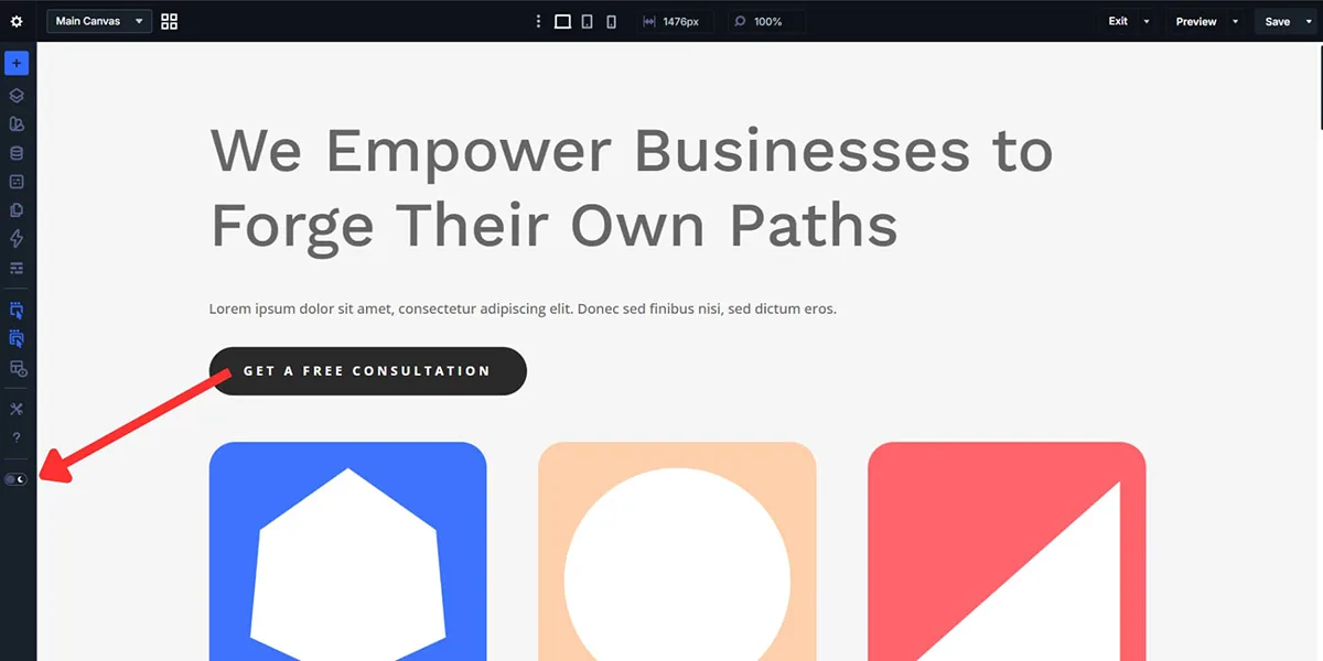
Divi 5’s Visual Builder includes a light/dark interface toggle, but it only changes how the editing environment looks to the person building the page — it doesn’t apply a dark theme to what visitors see. That’s a workspace-comfort feature, similar to dark mode in a code editor, not a design system for your published site.
It’s worth naming a third thing here too, since the terminology gets confusing fast: Elegant Themes separately sells a visitor-facing dark mode extension through its own marketplace, distinct from both the Builder’s interface toggle and from Darkify. If you’re comparing options, make sure you know which of the three you’re actually looking at before installing anything.
Why Divi Dark Mode Needs Extra QA
Divi generates highly specific, component-level styling, and different modules can carry independent colors and states. That’s not a flaw — it’s what gives Divi its design flexibility — but it also means dark mode has to reach every one of those independent settings, not just the theme’s base colors. Generated Divi styles can outrank a simplistic override, and cached CSS can make troubleshooting less obvious than it looks.
Divi 5’s Global Colors and Design Variables help by centralizing reusable values — colors, fonts, numbers, images, links — so a brand update applies everywhere at once. That’s a design-consistency tool, not a light/dark switching system: updating a Global Color changes it in both modes at once, it doesn’t give visitors a toggle. Centralized tokens make a dark-mode audit faster to reason about, but they don’t replace one.
Module Compatibility, Group by Group
Rather than reviewing every module individually, group them by how they typically behave. None of these are guarantees — “usually” is doing real work in each one.
Text and Content Modules
Text, Blog, Toggle, Accordion, Tabs, and Testimonial modules usually adapt with minor tweaks — but check headings, body text, links, muted metadata, borders, and active states separately. Divi modules can carry explicit colors that don’t automatically inherit from the page.
CTA and Button Modules
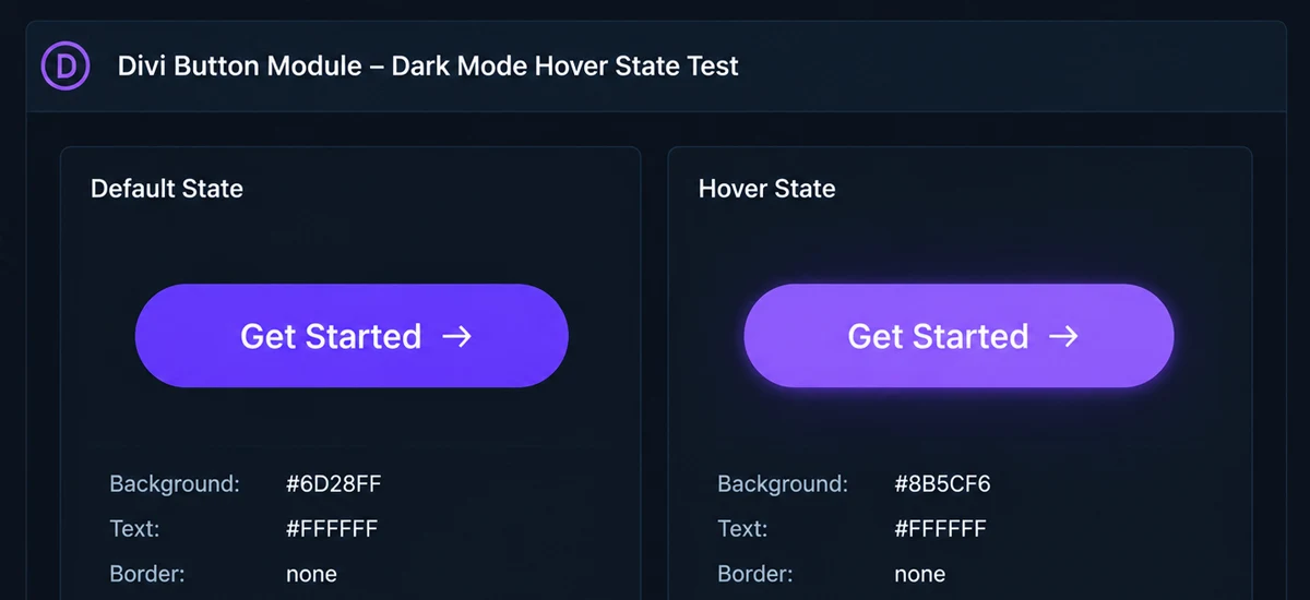
Check text, background, border, icon, hover, and focus states independently — a button can look correct at rest and fail on hover. Brand-critical CTA colors often deserve a deliberate dark-mode value instead of an automatic transformation; no single color converts better universally.
Blurb and Icon Modules
Check icon color, icon background, title, text, and the surrounding card surface. Don’t automatically invert brand icons, multicolor icons, or meaningful illustrations — treat them the way you’d treat a logo, not a generic graphic.
Image and Gallery Modules
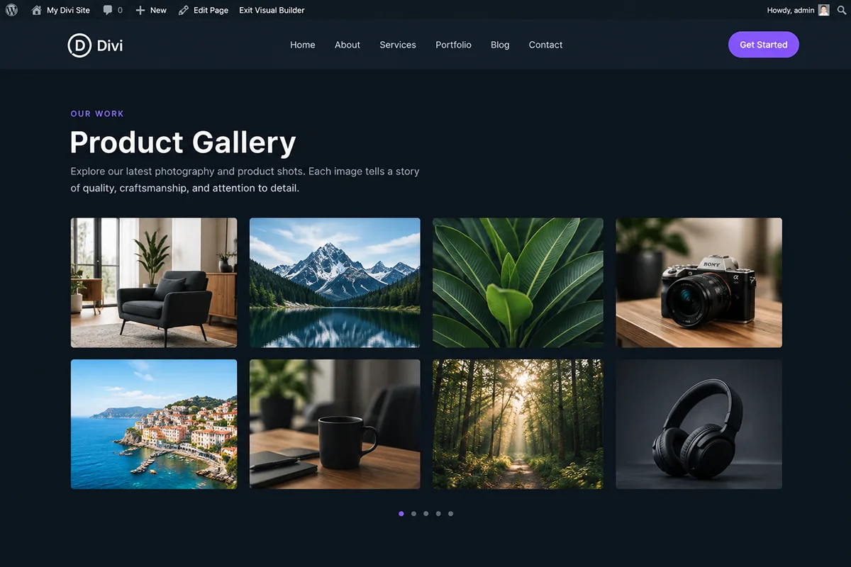
Photographs should normally preserve their actual colors. White logos, transparent PNG or SVG assets, monochrome illustrations, and decorative backgrounds each need different handling — a rule that works for one will often break another. Where verified, Darkify’s Pro media controls can exclude or replace specific images.
Slider, Fullwidth, and Hero Modules
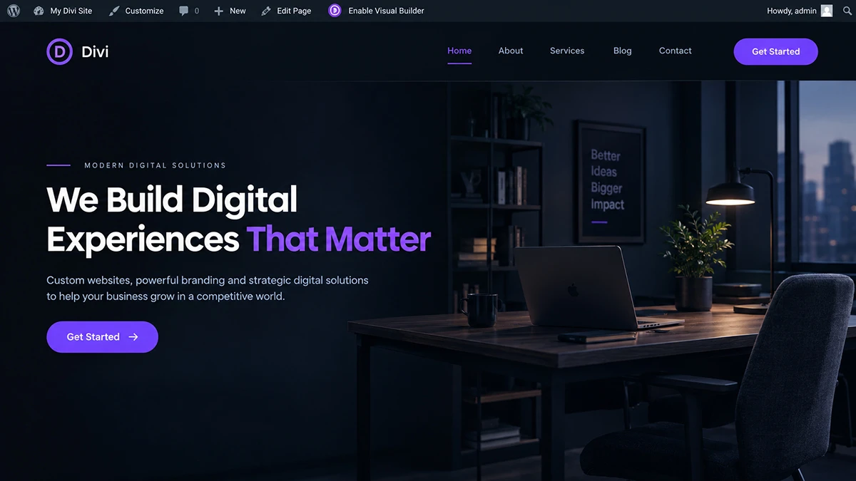
Test gradient, background image, overlay, slide text, CTA, and navigation arrows/dots across responsive states. Don’t default to excluding every gradient hero — use automatic adaptation where it preserves contrast, an explicit dark palette where the hero needs a controlled alternate, and protection where the asset should stay untouched.
Form Modules
Check labels, inputs, placeholders, borders, focus, error, and success states on Contact Form and Email Optin modules. Browser autofill styling is a separate problem from Divi’s own form styling — don’t assume one fix covers both.
Pricing Tables and Navigation
Preserve the visual hierarchy between standard and featured pricing plans. For navigation, check whichever pattern the site uses — the Menu module or Divi 5’s newer Link and Dropdown modules — including sticky, scroll, and submenu states, plus the mobile menu and logo.
Dividers and Decorative Elements
Divider modules, section dividers, and decorative borders often need a deliberate color adjustment to keep visual hierarchy intact — they’re easy to overlook precisely because they’re decorative.
Module Compatibility at a Glance
| Divi Area | Common Dark-Mode Issue | Default Handling | Review Needed |
|---|---|---|---|
| Text/Blog/Testimonial | Explicit module colors don’t follow the page | Usually automatic | Check active/hover states |
| Buttons/CTA | Hover or focus state left unreadable | Often needs explicit dark color | Test all interactive states |
| Blurb/Icon | Brand icon inverted or recolored | Protect/exclude | Icon and card background separately |
| Image/Gallery | Photography loses accuracy | Protect/exclude | Confirm against source asset |
| Slider/Hero | Overlay or gradient loses contrast | Often needs explicit dark color | Test every slide and viewport |
| Forms | Field borders or errors invisible | Test manually | Focus, error, and success states |
| Menu/Navigation | Submenu or sticky state unreadable | Test manually | Desktop, mobile, scroll state |
| Theme Builder templates | Header/footer untested separately | Test manually | Each assigned template |
Theme Builder: A Separate QA Pass
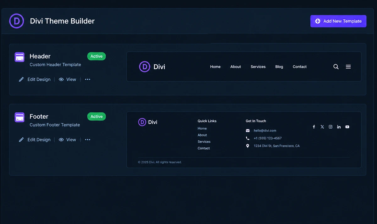
Theme Builder can control headers, footers, post templates, archive templates, and custom post types, depending on how a site is configured. A page body looking correct proves nothing about whether the header, footer, blog template, or 404 page looks correct — each is a separately assigned template that needs its own check.
Divi 5’s Complete Site Editing lets you edit Theme Builder areas from within the main Visual Builder session instead of switching to a separate screen, which makes this QA pass faster to run — jump between header, content, and footer without losing your place, and check each one in both modes before calling the site done.
Setting Up Darkify for a Divi Site
Start with Darkify, available free on WordPress.org. Its current plugin listing confirms compatibility with popular page builders including Divi, though a heavily customized layout should still be reviewed module by module rather than assumed to work without adjustment.
- Install and activate Darkify, then enable frontend dark mode.
- Choose manual visitor control or OS-aware behavior, where supported.
- Pick a switcher location, then test it against sticky headers and mobile menus.
- Test the homepage, a typical inner page, and a blog post in that order.
- Test the Theme Builder header and footer separately from page content.
- Identify modules that need explicit colors and media that should stay unchanged, then add exceptions only for those.
Divi layouts often pack a sticky header, mobile menu button, back-to-top control, and sometimes a chat widget or cookie banner into a small space. There’s no universal toggle position — test desktop, tablet, and mobile before settling on one.
Protecting the Design
Blanket visual inversion is a poor default for a heavily designed Divi site — photographs should stay faithful, brand colors carry meaning, gradients are often deliberate, and logos may need an alternate asset rather than a recolor. Where verified, Darkify’s Pro-tier controls handle this: element and page targeting for excluding specific sections, and media handling for excluding or replacing images like logos.
If the hero’s gradient is part of the brand, I’d give it an explicit dark-mode treatment rather than hoping an automatic transformation preserves the intent — that’s a deliberate design decision, not something worth leaving to chance.
Divi CSS vs. Darkify CSS: Keeping It Maintainable
Divi has its own site-level and module-level CSS locations, and Darkify Pro adds a dark-mode-specific CSS field. Splitting styles between the two isn’t automatically wrong, but duplicating the same dark-mode rule across Theme Options, page settings, module Custom CSS, a child theme, and Darkify makes future maintenance a guessing game. A workable rule: use normal Divi CSS for anything that should apply in both modes, and keep dark-mode-only overrides in one clearly defined layer.
/* Overrides a stubborn Divi module color only while dark
   mode is active. Replace .YOUR-DARK-MODE-CLASS with the
   actual class or attribute your dark-mode setup uses, and
   #YOUR-MODULE-ID with the specific module's CSS ID or
   class from Divi's own Advanced tab. */
.YOUR-DARK-MODE-CLASS #YOUR-MODULE-ID {
  color: #f5f5f5;
  background-color: #1e1e1e;
}
Scope this to a specific module class rather than a broad Divi selector, and avoid !important by default — reach for it only as a targeted last resort against a generated style that outranks everything else, not as your standard dark-mode strategy.
Troubleshooting: Divi Dark Mode Not Working
Work through this in order:
- Identify the affected area: whole page, one module, Theme Builder header/footer, mobile only, or a hover/sticky state.
- Confirm frontend dark mode is active, and test the published site rather than only the Builder view.
- Look for explicit Divi colors on the affected module, then check any Darkify exclusions already set.
- Test the Theme Builder template separately from page content.
- Check whether generated Divi CSS is stale — Divi 5’s cache handling notes stale CSS can persist until a cache is cleared, and Theme Options includes a Clear CSS Cache option for exactly this.
- Check page, plugin, or CDN caching layers, then third-party Divi modules or child-theme CSS.
“Looks right in the Builder but wrong on the live site” usually traces back to cached or stale generated CSS, or to the Builder’s own interface mode being confused with frontend dark mode — the Visual Builder preview doesn’t guarantee it reproduces every frontend state. Third-party modules, child themes, and layout packs can also ship their own styling; inspect their explicit colors and interactive states individually rather than assuming site-wide compatibility.
Dark Palette Starting Points
These are starting-point suggestions, not universal Divi colors — adjust them to your site’s actual brand identity, and verify contrast for your specific pairing before shipping it.
| UI Role | Example Color | Suggested Pairing | Note |
|---|---|---|---|
| Page background | #121212 | #f5f5f5 text | 17.2:1 contrast |
| Surface/card | #1e1e1e | #f5f5f5 text | 15.3:1 contrast |
| Primary text | #f5f5f5 | #121212 background | Same 17.2:1 pairing |
| Muted text | #b0b0b0 | #121212 background | 8.6:1 contrast |
| Border | #666666 | #121212 background | 3.3:1 — meets UI-component threshold |
| Links | #7aa2ff | #121212 background | Verify against your final blue |
| CTA/button | #2f5fdd | #ffffff text | 5.5:1 contrast |
Accessibility and Performance
WCAG’s contrast requirements cover body text, headings, links, button labels, UI boundaries, and focus indicators under different criteria — don’t flatten them into one number. Pure black backgrounds with pure white text don’t inherently fail accessibility; softer palettes are a readability preference, not a WCAG rule. Check hover, error, and success states specifically, since they’re the ones most often left unreadable.
The prefers-color-scheme media query reflects OS or browser preference — it’s distinct from both the Builder’s interface mode and a manually selected Darkify preference, and shouldn’t be treated as interchangeable with either. On performance, any added feature has some loading cost; treat vendor performance claims as vendor claims rather than independent measurements, and verify impact on your own Divi setup.
Pre-Launch Testing
- Homepage, inner page, and blog post
- Theme Builder header, footer, and archive/search templates
- Desktop, tablet, and mobile
- Manual toggle, OS light, and OS dark preference
- A refreshed page and navigation between pages
- Sticky header, mobile menu, and hover/focus states
- Buttons, forms, Text and Blurb modules, images, logos, galleries, and sliders
- Third-party Divi modules
- A logged-out visitor with normal caching enabled
Frequently Asked Questions
Making Divi Dark Mode Work With What You Already Built
Getting divi dark mode right means treating it as a compatibility review, not a single switch — module by module, template by template, with explicit colors where automatic adaptation isn’t good enough. If you want to test visitor-facing dark mode without building your own system, Darkify’s free version is a reasonable starting point; if your layout needs verified targeting, media handling, or custom CSS, Darkify’s documentation covers the Pro-tier controls that support it.