“Dark mode is more accessible” gets repeated so often it sounds settled. It isn’t. A darker interface can make a site more comfortable for some people, especially when bright screens are hard to tolerate — but other users read dark text on a light background more easily, and dark mode accessibility in WordPress depends on implementation, not color choice alone. WCAG doesn’t pick a winner between the two. Each color scheme a site offers still has to meet the same accessibility requirements on its own.
Key Takeaways
- WCAG 2.2 does not require websites to offer dark mode, and no WCAG success criterion mandates a site-provided light/dark toggle.
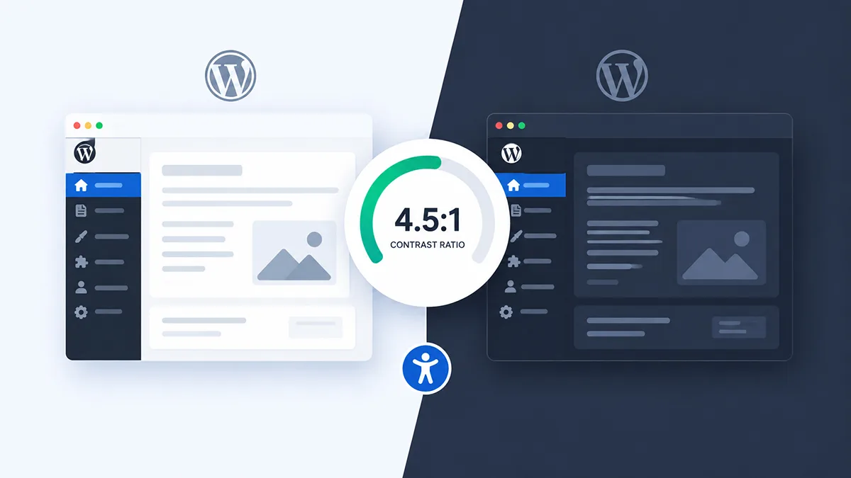
- WCAG’s contrast requirements apply identically to light and dark themes: normal text needs at least 4.5:1, large-scale text at least 3:1, for Level AA.
- Interactive controls and meaningful icons need at least 3:1 contrast against their surroundings — a requirement dark-mode plugins frequently miss even when body text passes.
- Peer-reviewed research has found dark text on a light background can outperform light text on a dark background in reading and proofreading tasks, for some readers.
- Lower-luminance interfaces can help some people with light sensitivity, while other users — including some with low vision — read more easily with a light background.
- A dark-mode toggle can support user preference, but installing one does not establish WCAG conformance for either mode.
Is dark mode accessible: Does Dark Mode Improve Accessibility?
It depends on the person and the implementation, not the color scheme itself. A lower-luminance interface can genuinely help some users, particularly those with light sensitivity who find bright screens uncomfortable. For other readers, dark backgrounds make text harder to scan — research on display polarity has repeatedly found reading and proofreading advantages for dark text on light backgrounds under tested conditions.
WCAG doesn’t mandate either one. It sets measurable outcomes — sufficient contrast, distinguishable controls, usable text presentation — that a light theme can meet or fail, and a dark theme can meet or fail, independently of which one you picked. Neither polarity has a built-in accessibility advantage; both need testing.
What WCAG 2.2 Actually Says
WCAG 2.2 is the current W3C Recommendation, and W3C advises using it for current accessibility work — WCAG 3 remains an in-progress draft, not something a site can conform to yet. None of WCAG’s success criteria mention dark mode by name. The criteria below are the ones most relevant to a dark-mode implementation.
| Criterion | Level | What It Covers | Dark-Mode Relevance |
|---|---|---|---|
| 1.4.1 Use of Color | A | Color isn’t the only way information is conveyed | Applies equally in both modes |
| 1.4.3 Contrast (Minimum) | AA | Text contrast against its background | Test each mode’s actual color pairs |
| 1.4.6 Contrast (Enhanced) | AAA | Stronger text contrast | Optional, higher target beyond AA |
| 1.4.8 Visual Presentation | AAA | User control over text presentation, among several sub-requirements | Related to personalization — not a dark-mode mandate |
| 1.4.11 Non-text Contrast | AA | UI components, states, and meaningful graphics | Test controls and icons in both modes |
A brief compliance note: WCAG is widely used as the technical accessibility standard, but the legal requirements that reference it vary by jurisdiction and context. If you’re making a compliance decision, that’s a question for your legal counsel or an accessibility auditor, not something this article — or a dark-mode plugin — can settle for you.
Contrast Requirements Don’t Change in Dark Mode
SC 1.4.3 requires a contrast ratio of at least 4.5:1 for normal text and 3:1 for large-scale text (roughly 18-point, or 14-point bold) — with narrow exceptions for incidental text and logotypes. That threshold doesn’t shift based on which color is the background. A dark background with slightly-too-dark text fails the same way a light background with slightly-too-light text does; polarity is irrelevant to the math.
Calculated examples make this concrete. In light mode, #333333 text on a #ffffff background reaches 12.63:1 — a comfortable pass. #aaaaaa on the same white background drops to 2.32:1 — a clear fail. In dark mode, #e0e0e0 text on a #121212 background reaches 14.19:1, passing easily; #6b6b6b text on a #2a2a2a surface falls to 2.69:1, failing the same 4.5:1 threshold. A dark theme that “looks dark enough” can still fail WCAG if the actual pairing is too close.
Buttons, Inputs, and Icons Need Contrast Too
SC 1.4.11 requires at least 3:1 contrast for UI components and meaningful graphics against their adjacent color — form field boundaries, buttons, focus indicators, and icons that convey meaning. A dark-mode plugin can correctly recolor body text and still leave a form border nearly invisible: #8a8a8a against a #121212 background reaches 5.43:1 and passes, while #2f2f2f against the same background lands at 1.40:1 and clearly fails. Search boxes, pagination controls, and toggle switches are the details most often missed.
User Needs Vary — That’s the Real Story
W3C’s low-vision guidance describes light sensitivity, or photophobia, as one aspect of low vision some people experience — bright interfaces can cause discomfort or eye pain for these users, and a lower-luminance interface may be more comfortable. That’s a real, defensible reason to offer a dark option. It isn’t a reason to assume dark mode is better for everyone with a visual impairment; low vision covers a wide range of conditions, and some of those users need higher contrast or specific color combinations that a dark theme doesn’t automatically provide.
The other side of this is backed by controlled research rather than assumption. Piepenbrock, Mayr, and Buchner found that positive-polarity displays — dark text on a light background — produced smaller pupil sizes and better proofreading performance than negative polarity in both younger and older adults, an effect a related 2025 study found replicates in newer display contexts. The proposed mechanism: higher luminance constricts the pupil, sharpening the retinal image. These were controlled reading-task studies, not a verdict on every real-world reading situation, but they’re a legitimate reason dark mode preference isn’t universal — even among people with visual accessibility needs.

Does WCAG Say Users Should Be Able to Choose?
Not as a general requirement. SC 1.4.8, Visual Presentation, includes a requirement that a mechanism exist for users to select their own foreground and background colors — but it’s one part of a multi-part, Level AAA criterion, the least commonly mandated conformance tier. Its own Understanding page states this plainly: “the mechanism can be provided by the browser or other user agent. Content is not required to provide the mechanism.” A site doesn’t have to build its own toggle for this criterion; a browser reader mode or OS-level setting can satisfy it instead.
That doesn’t make a dark-mode toggle pointless — offering both light and dark presentations, implemented accessibly, is a genuinely useful way to respect differing preferences. It just isn’t what WCAG requires, and it shouldn’t be described as satisfying 1.4.8 by itself.
Building and Testing a More Accessible Dark Mode
Treat a dark theme as its own presentation to test, not an automatic derivative of the light one — a site passing accessibility checks in light mode tells you nothing about whether its dark mode does.
- Test text contrast against every background it actually appears on, not just the page background.
- Test UI controls — buttons, form fields, toggles, icons — against the 3:1 non-text threshold.
- Don’t rely on color alone for errors, success, or active states; pair color with an icon, label, or pattern.
- Keep focus indicators visible — keyboard focus needs to stay obvious against a dark background, not just a light one.
- Check links, placeholders, and muted text, which commonly get set too faint against dark backgrounds.
- Test actual forms — field backgrounds, borders, labels, and error messages, not just static screenshots.
- Check images, SVGs, and logos for transparent backgrounds or dark strokes that disappear against a dark surface.
- Test hover, focus, and disabled states individually — a control that looks right at rest can still fail interactively.
Automated contrast checkers catch the math but not everything else — pair them with keyboard testing and manual visual review, and treat a passing automated scan as a starting point rather than a compliance certificate. The most common mistake isn’t a bad color choice; it’s assuming dark mode equals accessible and stopping the check there.
What Dark Mode Does Not Fix
Adding dark mode is not an accessibility audit. It does nothing by itself about missing alt text, poor heading structure, keyboard traps, missing form labels, inaccessible menus or authentication flows, missing captions, incorrect focus order, or broken semantic markup — the issues that make up most real accessibility failures. A beautifully executed dark theme sitting on top of those problems doesn’t change any of them.
That’s worth saying plainly because “we added dark mode” can start to feel like progress on accessibility when it’s really a separate, narrower improvement — one presentation option among the many things a genuinely accessible site needs to get right.
How Darkify Fits Into Dark Mode Accessibility
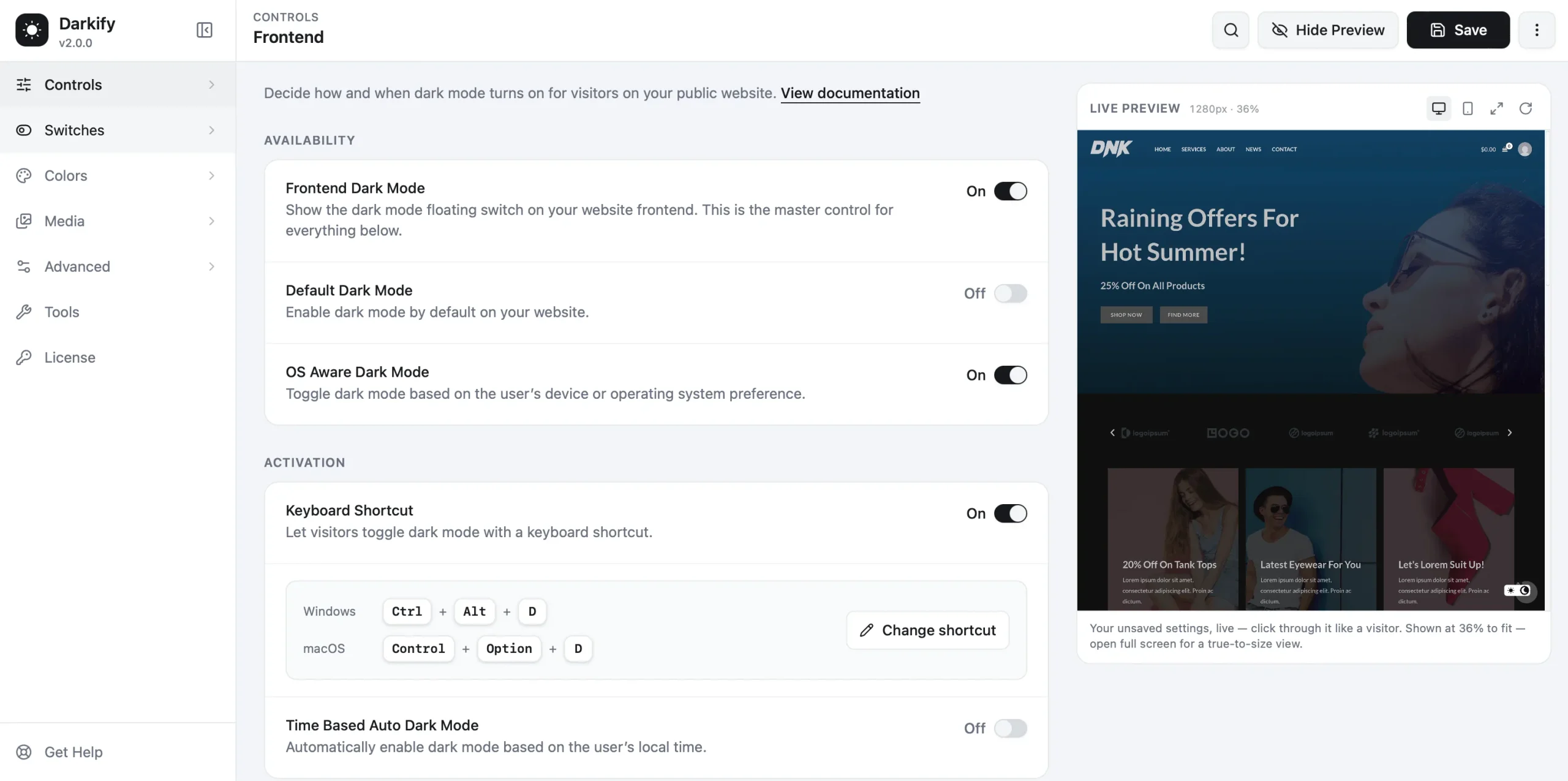
Darkify is a WordPress dark-mode plugin that gives visitors an alternative visual presentation and control over whether they use it — it isn’t an accessibility-compliance tool, and installing it doesn’t make a site WCAG conformant. What it provides, per its current WordPress.org listing and documentation, is implementation infrastructure: a frontend switcher with OS-aware detection in the free version, plus color customization and presets.
Pro-tier controls add a dark-mode-specific custom CSS field and element or page exclusions — useful for correcting the exact contrast failures this article covers, like a low-contrast border or a logo that disappears, once you’ve actually found them through testing. The color pickers help you choose values; they don’t guarantee the values you pick are compliant. That check is still on you. If you’re comparing dark-mode plugins, this comparison covers feature differences, not accessibility claims one way or the other.
Frequently Asked Questions
Dark Mode Is an Option, Not a Certificate
WCAG doesn’t require a dark theme, and adding one doesn’t certify accessibility. A responsibly built dark mode preserves the same contrast requirements as light mode, keeps controls and icons distinguishable, and doesn’t break focus or interactive states — giving users another presentation choice without pretending that choice is the whole job. The better goal isn’t forcing everyone into one polarity; it’s building both well enough that neither blocks the reader who needs it.
If you’re implementing a frontend toggle on WordPress, Darkify’s general setup guide covers installation, and the admin dark-mode guide covers the dashboard and login screen — test whatever you build against the criteria above before calling it done.