
A preset is the whole dark-mode palette for your site in one click. Darkify Pro ships eleven of them, and every colour inside a preset can be edited to match your brand.
Find them at Darkify → Colors → Preset.
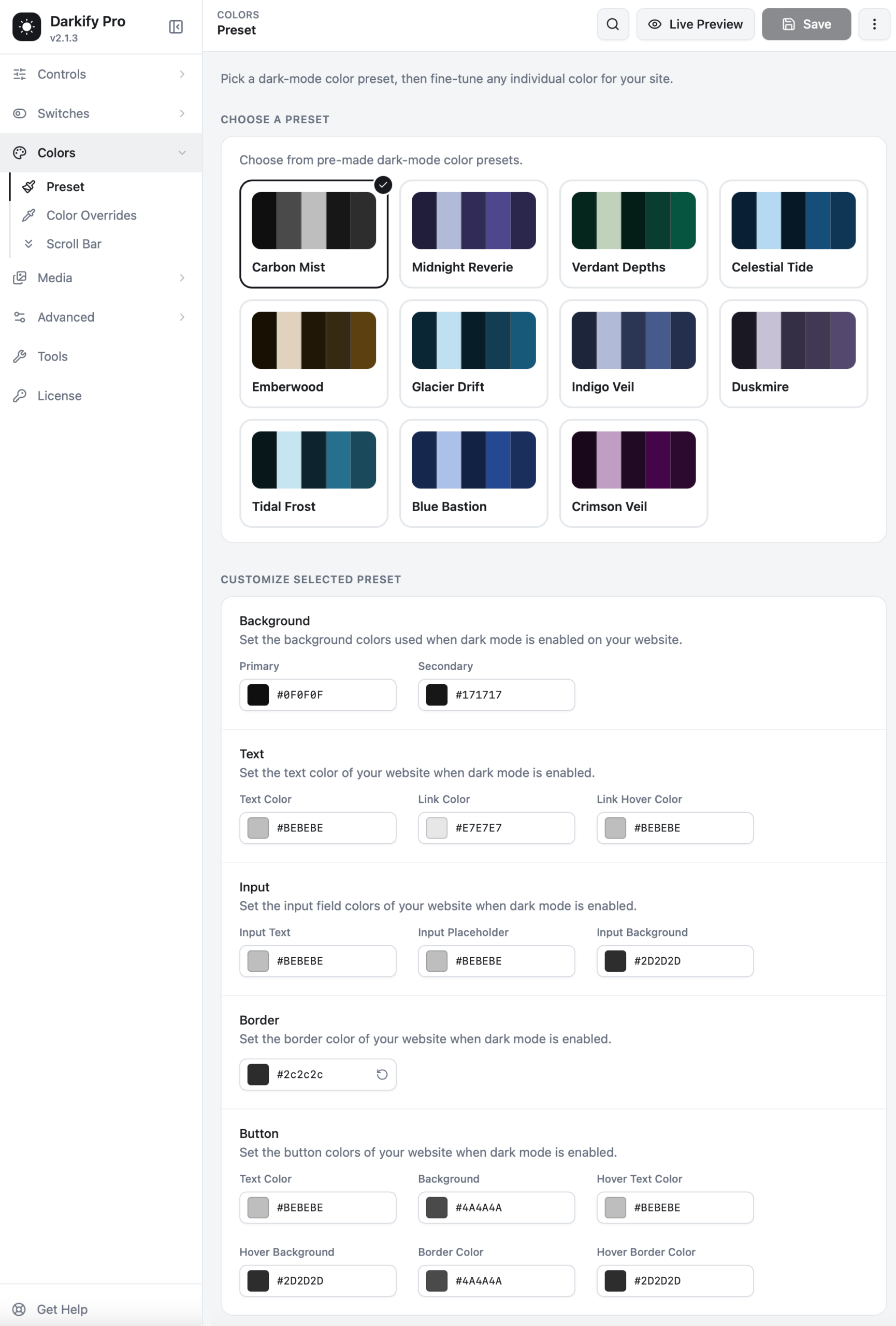
The eleven presets #
| Preset | Character | Works well for |
|---|---|---|
| Carbon Mist | Neutral greys, no colour cast | The safe default for any brand |
| Midnight Reverie | Deep violet | Creative and portfolio sites |
| Verdant Depths | Forest green | Wellness, outdoors, sustainability |
| Celestial Tide | Navy with bright accents | Corporate and finance |
| Emberwood | Warm brown and amber | Food, craft, hospitality |
| Glacier Drift | Cool teal | Tech and SaaS |
| Indigo Veil | Soft indigo | Editorial and long-form reading |
| Duskmire | Muted plum | Fashion and lifestyle |
| Tidal Frost | Deep cyan | Travel and marine |
| Blue Bastion | Confident blue | Agencies and B2B |
| Crimson Veil | Dark magenta | Entertainment and events |
Click any swatch and the live preview updates instantly, across your whole site — not just the visible section.
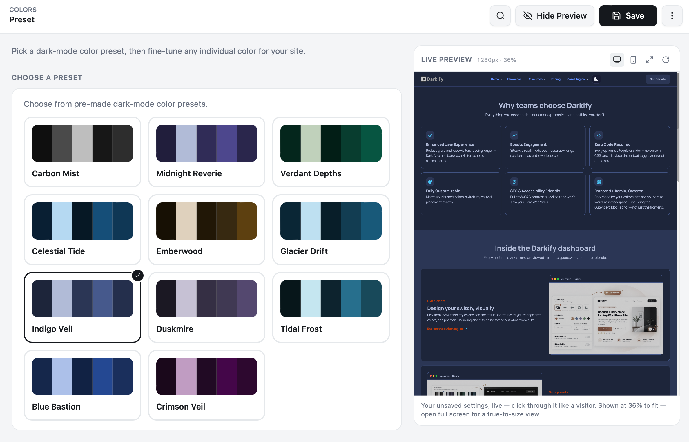
Customising the selected preset #
Beneath the swatches, the preset breaks into individual colour groups. Change any of them and the preset becomes your own.
Background #
Primary is the main page background. Secondary is used for cards, sidebars, table stripes and any raised surface. Keeping them a few shades apart is what stops a dark page from looking flat.
Text #
Text Color, Link Color and Link Hover Color. Pure white on a dark background causes glare — Darkify’s defaults use a slightly softened light grey for exactly that reason. Keep link colours clearly distinct from body text.
Input #
Input Text, Input Placeholder and Input Background. Check your contact and checkout forms after changing these; placeholder text is the first thing to become unreadable if the contrast drops too low.
Border #
One value controls the border colour used across the site. It should be visible against your primary background without drawing attention to itself.
Button #
Six fields: text colour, background, hover text colour, hover background, border colour and hover border colour. Buttons are where dark mode most often goes wrong, so Darkify gives each state its own control.
Keep it readable. Aim for at least a 4.5:1 contrast ratio between text and its background — the WCAG AA standard for body text. Any free contrast checker will confirm a pair in seconds, and it is the difference between a dark mode people use and one they switch off.
A quick workflow #
- Pick the preset closest to your brand.
- Set Primary and Secondary backgrounds first — everything else reads against them.
- Adjust text and link colours until body copy is comfortable.
- Style buttons and inputs last.
- Scroll the live preview through a real page, a blog post and a form before saving.
When a preset is not enough #
If one specific colour needs a fixed dark-mode counterpart — a brand red, a status badge, a chart colour — use Color Overrides rather than bending the whole preset around it.


