
The floating switch is the toggle visitors use to turn dark mode on and off. Darkify Pro ships 16 designs, seven sizes, four corner positions and a set of attention effects — all editable without CSS.
Find it at Darkify → Switches → Floating Switch.
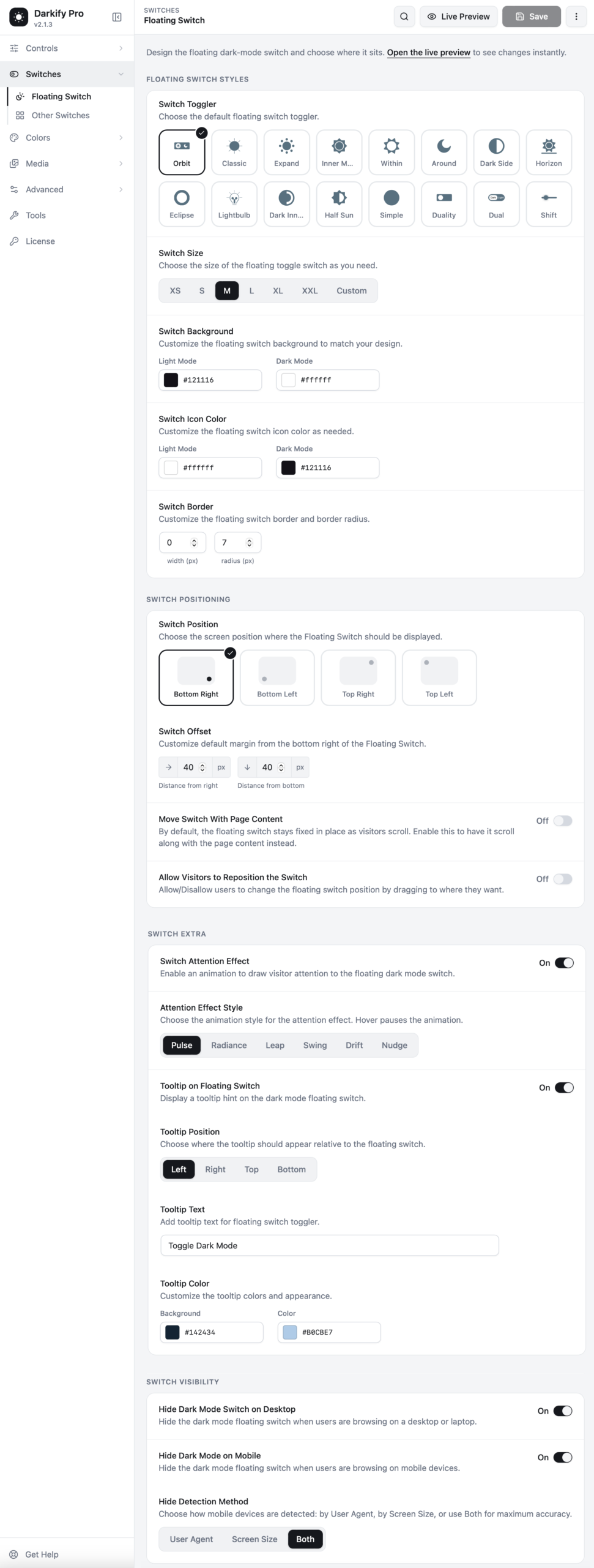
Floating switch styles #
Switch Toggler #
Pick the design. The sixteen styles are Orbit, Classic, Expand, Inner Moon, Within, Around, Dark Side, Horizon, Eclipse, Lightbulb, Dark Inner, Half Sun, Simple, Duality, Dual and Shift. Each one animates differently when clicked, and the live preview shows the animation immediately.
If you are undecided: Orbit and Classic suit most sites, Simple and Dual read as pill-shaped toggles, and Lightbulb works well on playful brands.
Switch Size #
Seven steps from XS to XXL, plus Custom if you want an exact pixel value. M is the default and works on most layouts. Go smaller on content-dense pages, larger if your audience skews mobile.
Switch Background and Switch Icon Color #
Each takes two values — one for light mode, one for dark mode — so the switch stays visible in both states. The defaults invert cleanly: a dark switch with a light icon on a light page, and the reverse on a dark page.
Switch Border #
Set border width and corner radius in pixels. A radius equal to half the switch height gives you a perfect circle or pill; lower it for a squarer look.
Switch positioning #
Switch Position #
Choose which corner it sits in: bottom right, bottom left, top right or top left. Bottom right is the convention and the default.
Switch Offset #
Fine-tune the distance from the edges in pixels. Raise the bottom offset if the switch collides with a cookie banner, chat widget or sticky footer bar.
Move Switch With Page Content #
Off by default, which keeps the switch fixed while visitors scroll. Turn it on and the switch scrolls with the page instead, so it only appears at the position where you placed it.
Allow Visitors to Reposition the Switch #
Lets visitors drag the switch to wherever suits them. Handy on sites with heavy sticky UI, where a fixed corner might cover something important.
Switch extras #
Switch Attention Effect #
A subtle animation that draws the eye to the switch, so first-time visitors notice dark mode exists. Choose from Pulse, Radiance, Leap, Swing, Drift and Nudge. The animation pauses on hover so it never fights with the click.
Tooltip on Floating Switch #
Shows a short hint next to the switch. Set the position (left, right, top, bottom), the text — “Toggle Dark Mode” by default — and the background and text colours.
A tooltip is worth turning on if your switch design is abstract. It removes any guesswork about what the button does.
Switch visibility #
Hide on desktop / Hide on mobile #
Two independent toggles. You might hide the floating switch on desktop because you already placed a switch in your navigation menu, then keep it on mobile where the menu is collapsed.
Hide Detection Method #
How Darkify decides whether a visitor is on mobile:
- User Agent — reads the browser’s device string.
- Screen Size — reads the viewport width.
- Both — requires both signals to agree. This is the most accurate and the default.
Before you hide the switch everywhere: make sure another toggle exists — a menu switch, a shortcode, or the keyboard shortcut. Otherwise visitors have no way to leave dark mode.
Accessibility #
The switch is a real button. It is reachable by keyboard, announces its state to screen readers, and respects the visitor’s reduced-motion preference — attention effects are suppressed automatically for anyone who has asked their system to limit animation.


