
Custom CSS is where you handle the last five percent — the one element that needs different styling in dark mode, without touching your theme files.
Find it at Darkify → Advanced → Custom CSS.
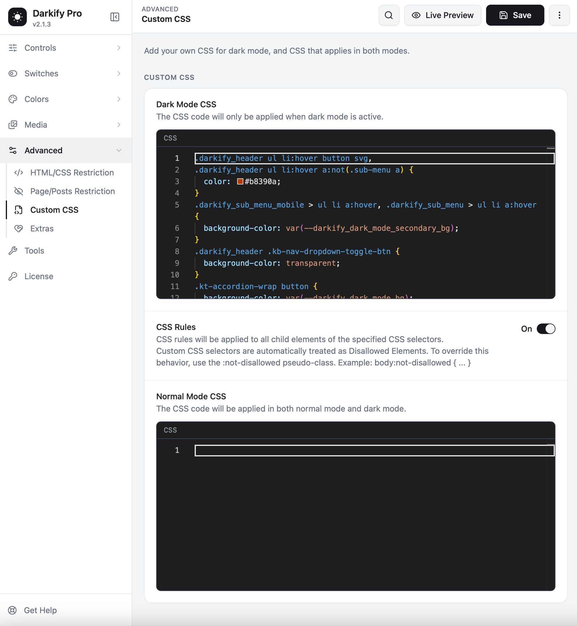
Dark Mode CSS #
CSS entered here applies only while dark mode is active. In light mode it is not loaded at all, so there is no risk of affecting your normal design.
.site-header .logo-badge {
    background-color: #1c1c1c;
    border-color: #3a3a3a;
}

.pricing-card--featured {
    box-shadow: 0 0 0 1px #2c2c2c;
}
The editor gives you syntax highlighting, line numbers and bracket matching, so mistakes are easy to spot.
Using Darkify’s colour variables #
Rather than hard-coding hex values, you can reference the variables from your active preset. Your custom CSS then follows along automatically whenever you change presets:
.kt-accordion-wrap button {
    background-color: var(--darkify_dark_mode_bg);
}

.darkify_sub_menu > ul li a:hover {
    background-color: var(--darkify_dark_mode_secondary_bg);
}| Variable | Value |
|---|---|
--darkify_dark_mode_bg | Primary background |
--darkify_dark_mode_secondary_bg | Secondary background |
--darkify_dark_mode_text_color | Body text colour |
--darkify_dark_mode_link_color | Link colour |
--darkify_dark_mode_border_color | Border colour |
CSS Rules #
When this toggle is on, your rules are applied to all child elements of the selectors you wrote, and the selectors you use in Custom CSS are automatically treated as Disallowed Elements — meaning Darkify stops processing them itself and lets your CSS take over cleanly.
If you want Darkify to keep processing an element you have also styled, add the :not-disallowed pseudo-class:
body:not-disallowed {
    /* Darkify still handles this element */
}
Normal Mode CSS #
The second editor applies in both light and dark mode. Use it for anything mode-independent — positioning the switch relative to a sticky header, spacing adjustments, or styling you want alongside dark mode without editing your theme.
Try the settings first. Most things people write CSS for are already available as a control: colours in Presets, single colours in Overrides, whole sections in Restriction. Custom CSS is for what is left over.
Practical examples #
Keep a logo at full brightness #
.site-logo img {
    filter: none !important;
}
Soften a bright border #
.entry-card {
    border-color: var(--darkify_dark_mode_border_color);
}
Style a third-party widget #
.reviews-widget__card {
    background: #161616;
    color: #e2e2e2;
}
Tips #
- Watch the live preview as you type — you will see the effect before saving.
- Add
!importantonly when a rule genuinely refuses to apply. - Keep a comment above each block explaining what it fixes. You will thank yourself in six months.
- Export your settings from Tools after writing substantial CSS, so it is backed up.


