
The floating switch is not your only option. Darkify can place a dark mode toggle inside your navigation menus, output one anywhere through a shortcode, or turn any element you already have into a switch.
Find these at Darkify → Switches → Other Switches.
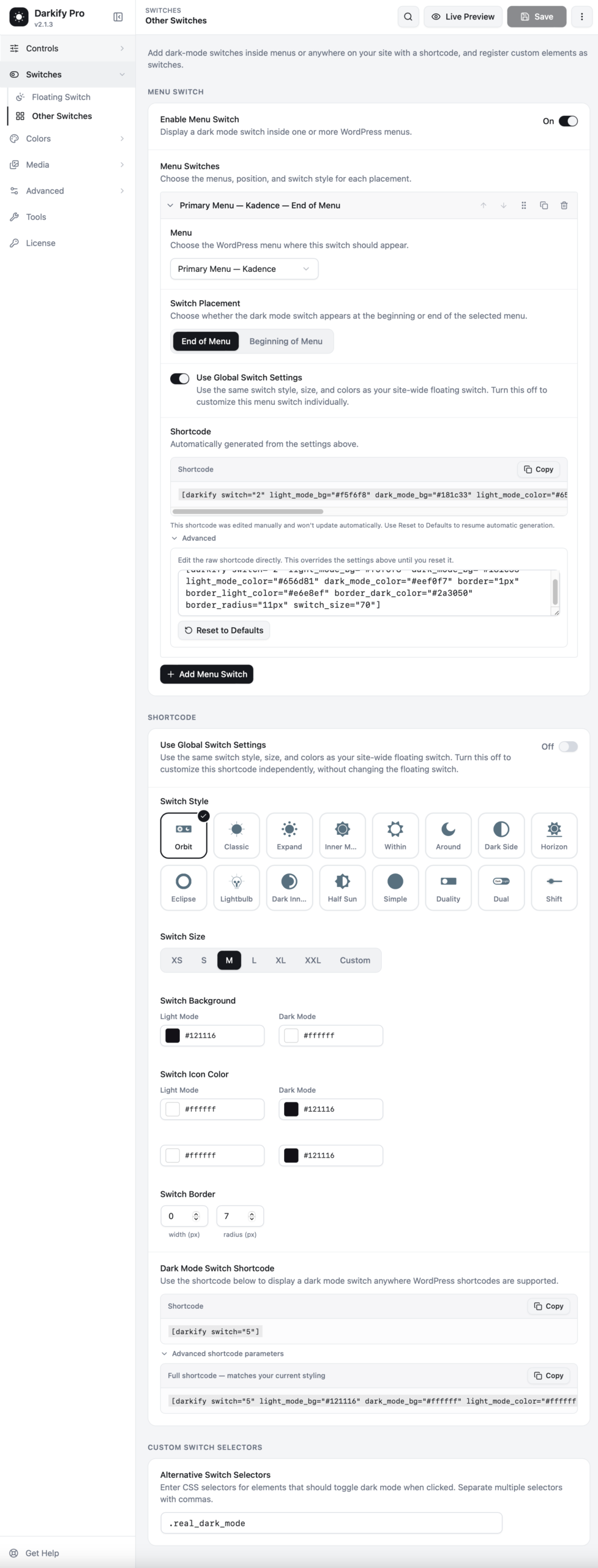
Menu switch #
A toggle inside your navigation is the most discoverable placement there is — it sits exactly where people look for site controls.
Setting one up #
- Turn on Enable Menu Switch.
- Click Add Menu Switch.
- Pick the Menu it belongs to. Every menu registered by your theme appears in the dropdown.
- Choose Switch Placement — beginning or end of that menu.
- Leave Use Global Switch Settings on to inherit the floating switch’s style, or turn it off to design this one separately.
You can add as many menu switches as you have menus. Each row can be reordered, duplicated or deleted with the icons in its header.
The generated shortcode #
Darkify writes a shortcode for each menu switch automatically, based on the styling you chose. Open Advanced to edit that shortcode by hand — useful for one-off tweaks. Once you edit it manually, it stops updating automatically; press Reset to Defaults to hand control back to the settings panel.
The shortcode switch #
Use this to place a toggle anywhere WordPress shortcodes work: a page, a post, a widget area, a footer block, an Elementor text widget.
The simplest form is:
[darkify switch="5"]The number selects the switch design. Under Advanced shortcode parameters, you will find a full version that matches your current styling, ready to copy:
[darkify switch="5" light_mode_bg="#121116" dark_mode_bg="#ffffff" light_mode_color="#ffffff" dark_mode_color="#121116" border="1px" border_light_color="#e6e8ef" border_dark_color="#2a3050" border_radius="11px" switch_size="70"]| Parameter | What it sets |
|---|---|
switch | Which switch design to render |
light_mode_bg / dark_mode_bg | Switch background in each mode |
light_mode_color / dark_mode_color | Icon colour in each mode |
border | Border width |
border_light_color / border_dark_color | Border colour in each mode |
border_radius | Corner radius |
switch_size | Size in pixels |
Turn off Use Global Switch Settings in the Shortcode section if you want the shortcode switch styled independently of your floating switch.
Using it in a PHP template #
<?php echo do_shortcode( '[darkify switch="5"]' ); ?>Custom switch selectors #
Already have a button, icon, or menu item you would rather use? Enter its CSS selector under Alternative Switch Selectors, and Darkify will toggle dark mode when that element is clicked.
.real_dark_mode, #header-theme-toggle, .site-nav .mode-btnSeparate multiple selectors with commas. Any element matching one of them becomes a working toggle — no JavaScript needed on your side.
Tip: combine placements. Many sites keep a menu switch on desktop, hide the floating switch on desktop, and let the floating switch handle mobile where the menu is behind a hamburger icon.
The Gutenberg block #
Darkify registers a native block called Dark Mode Switcher. In the block editor, open the inserter, search for Darkify or dark mode, and drop it into any post, page or template part.
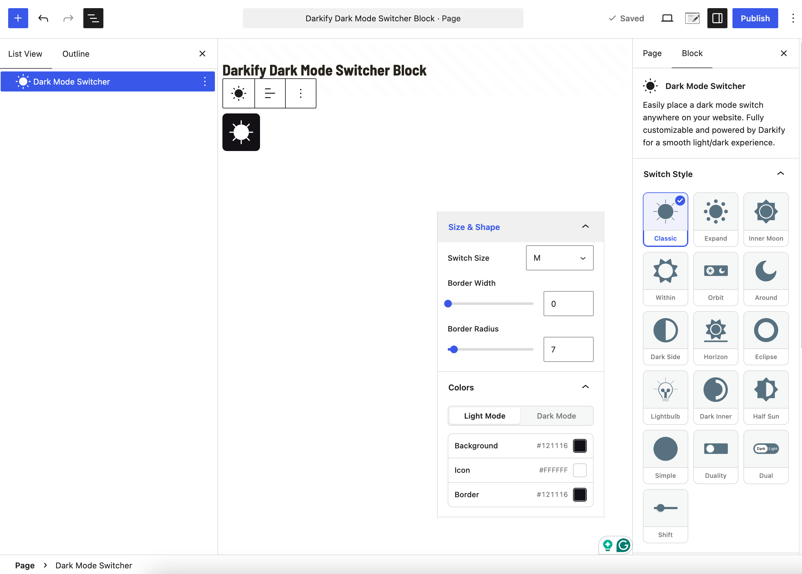
Unlike the shortcode, the block is styled entirely from the editor sidebar, and what you see on the canvas is what visitors get.
Switch Style #
All sixteen switch designs appear as a visual grid: Classic, Expand, Inner Moon, Within, Orbit, Around, Dark Side, Horizon, Eclipse, Lightbulb, Dark Inner, Half Sun, Simple, Duality, Dual, and Shift. Click one and the block on the canvas updates immediately.
Size & Shape #
- Switch Size — the same XS to XXL scale used elsewhere in Darkify.
- Border Width — a slider, in pixels.
- Border Radius — a slider, in pixels. Raise it for a pill, drop it to zero for a square.
Colors #
The colour panel has two tabs, Light Mode and Dark Mode, and each one carries three values:
- Background — the switch background.
- Icon — the sun or moon inside it.
- Border — only visible if you set a border width above zero.
Setting both tabs means the switch stays visible whichever mode the page is currently in.
Alignment #
The block toolbar carries the standard alignment control, so the switch can sit left, centre, or right within its column.
Block themes: because the block works in template parts as well as posts, you can place a switch directly in your site header or footer template and have it appear on every page — without touching a menu or a shortcode.
The Elementor widget #
Darkify ships a native Elementor widget called Darkify Switcher. Search the Elementor widget panel for Darkify and drag it into any section, column, or flexbox container.
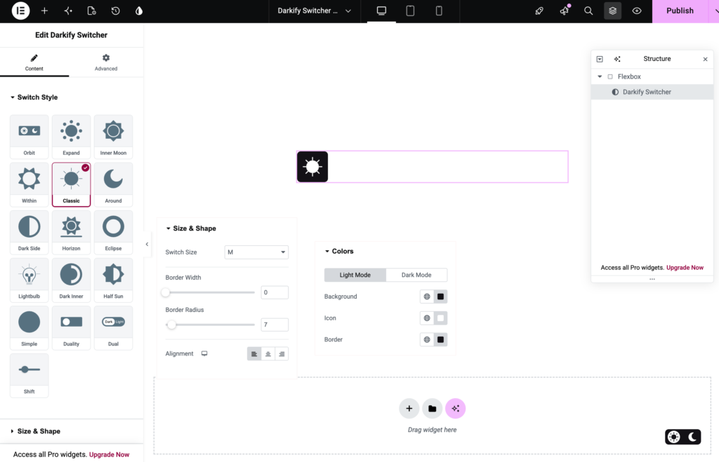
It behaves like any other Elementor widget: it appears in the Structure panel, it can be saved to a template, and it respects your container’s layout settings.
Content tab #
- Switch Style — the same visual grid of sixteen designs.
- Size & Shape — Switch Size, Border Width, Border Radius, plus an Alignment control.
- Colors — Light Mode and Dark Mode tabs, each with Background, Icon and Border.
Two things worth knowing #
Alignment is responsive. The alignment control carries Elementor’s device icon, so you can align the switch left on desktop and centre it on mobile.
Colours support Elementor globals. Each colour field has the globe icon, which means you can bind the switch to a global colour from your Elementor site settings. Change the global later, and the switch follows automatically — useful when a brand palette gets revised.
Advanced tab #
The standard Elementor Advanced tab is available too: margin, padding, z-index, responsive visibility, custom CSS classes, and motion effects all work as they would on any other widget.
Choosing between the placements #
| Use | When |
|---|---|
| Floating switch | You want one switch available everywhere, in a fixed corner |
| Menu switch | You want it where people already look for site controls |
| Gutenberg block | You build with blocks and want the switch inside a specific layout or template part |
| Elementor widget | You build with Elementor and want responsive alignment and global colours |
| Shortcode | You need it somewhere none of the above reach — a widget area, a PHP template, a third-party builder |
| Custom selector | You already built a button and would rather reuse it |


